Theatre Poster | Illustration and Promotional Typography
For this poster for Paradise Theatre Company’s production, I drew a moonlit landscape illustration to establish the play’s reflective, romantic atmosphere. A large red title contrasts with the deep blue field, giving the play’s name priority before the viewer reaches the supporting information.
Simplified vector forms, silhouetted trees, and translucent layers create depth without competing with the title. Credits, dates, venue details, and contact information occupy a more restrained lower register. The composition depends on a clear division of responsibilities: illustration establishes mood, and typography turns that initial attention into usable event information.
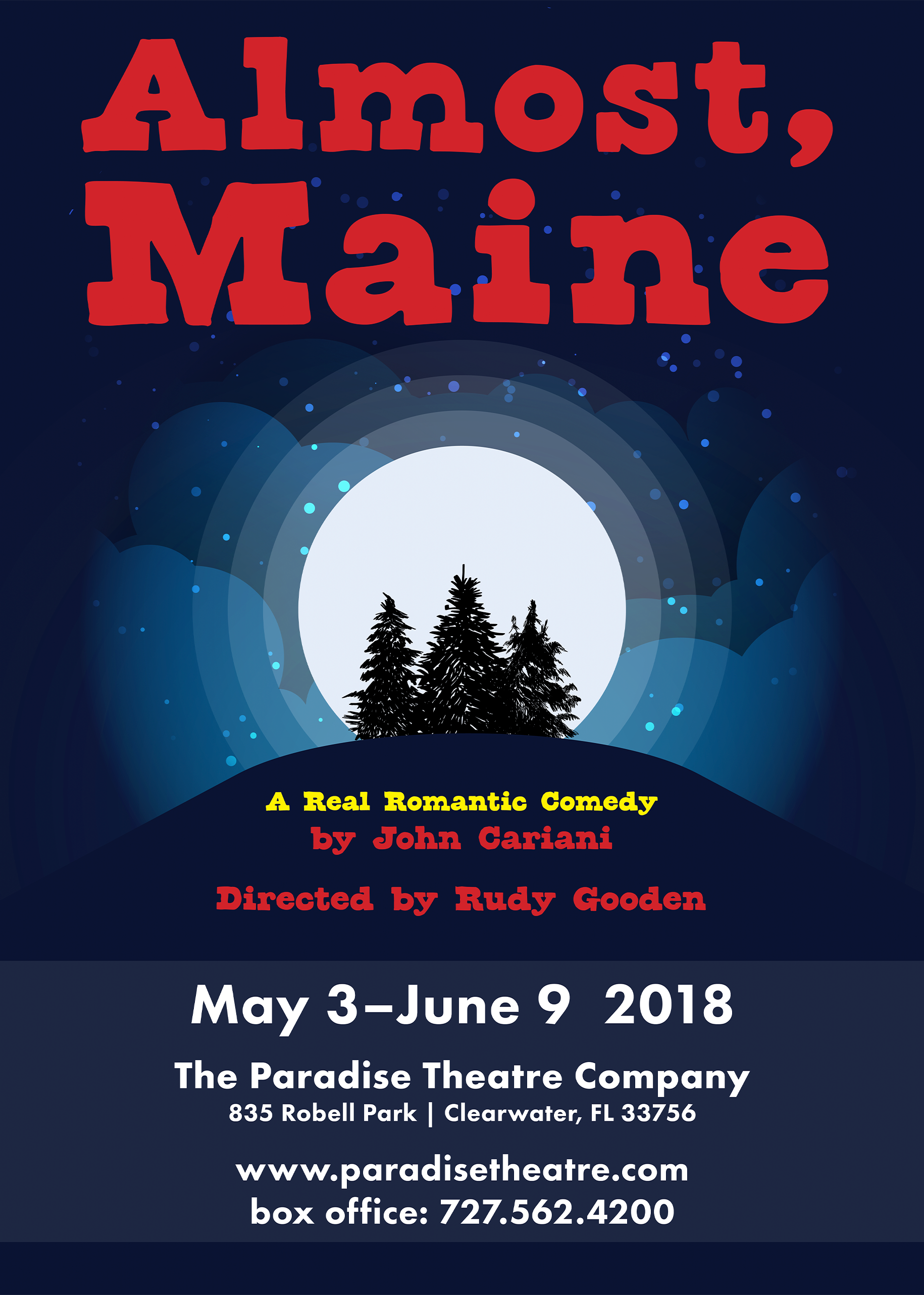
Poster: A centralized moonlit scene supports the production’s tone, while scale and color distinguish the title from the logistical details below.

