Architecture Publication | Editorial Systems
Architectural publications must reconcile the scale of buildings with the scale of reading. The brief was to introduce one of TIME’s 100 Most Influential People through a booklet. In this publication on Bjarke Ingels and BIG, I developed a flexible editorial structure for photographs, renderings, drawings, project data, quotations, and descriptive text.
Project identifiers and metadata provide a recurring framework, while asymmetrical compositions and shifts in image scale respond to the material of each project. Dense explanatory pages alternate with full-bleed images. Overlays and inset images bring related information together; restrained text columns preserve a stable place for reading.
The publication explores the boundary between consistency and responsiveness. Its grid provides continuity across varied content. Gold project abbreviations, borrowed from BIG’s own project-code system, and pale drawing overlays establish a recurring reference system, while changes in pacing respond to the architecture of each project.

Book mockup: Multiple spreads reveal the publication’s range of image scale and page density.
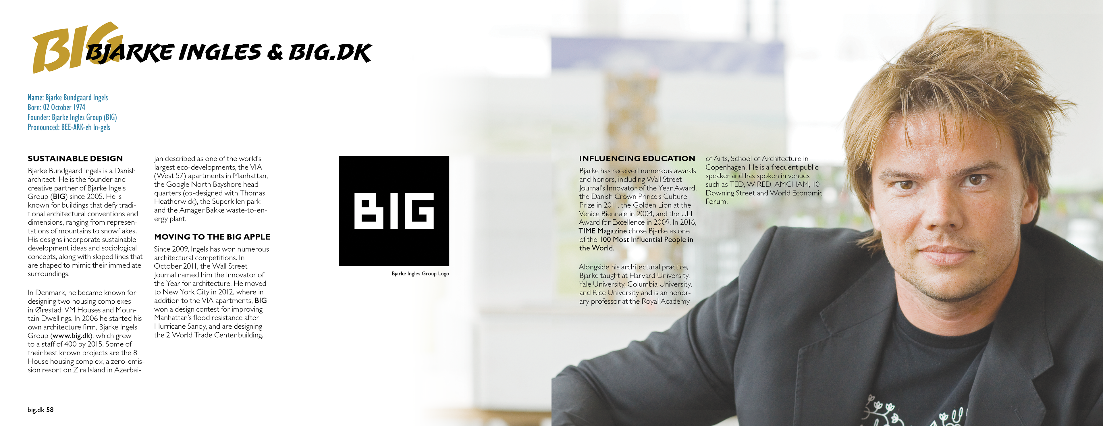
Introduction: Portraiture, studio identity, and biographical text establish the subject through contrasting levels of emphasis.
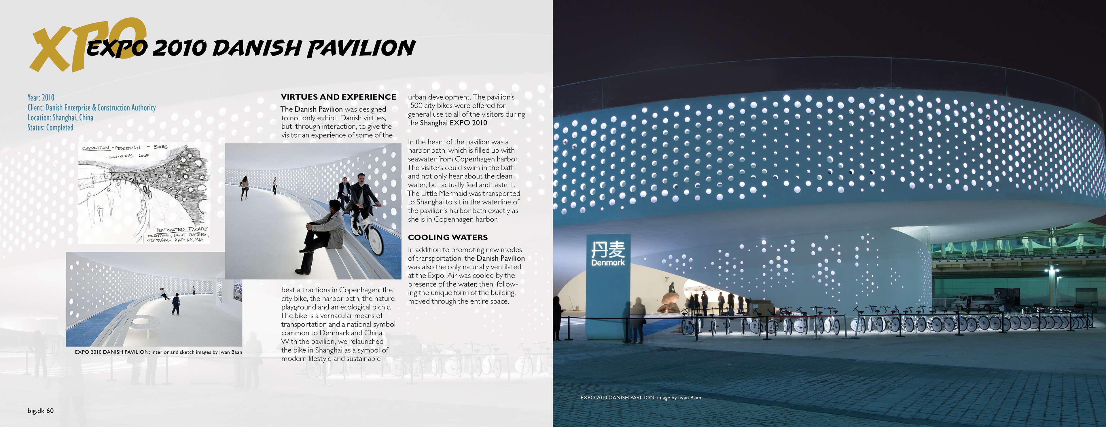
Project documentation: Metadata, sketches, and supporting images face a dominant architectural photograph.
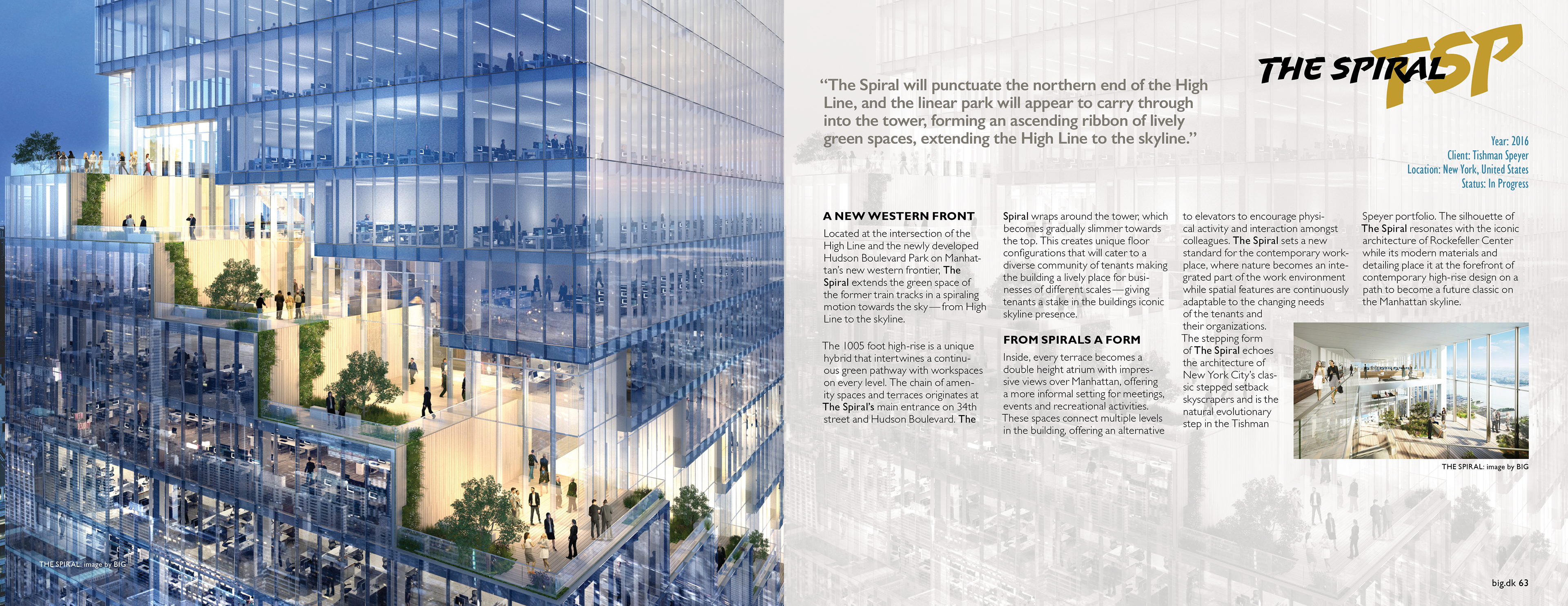
Layered spread: A rendering provides context for a quotation, project description, and captioned images.
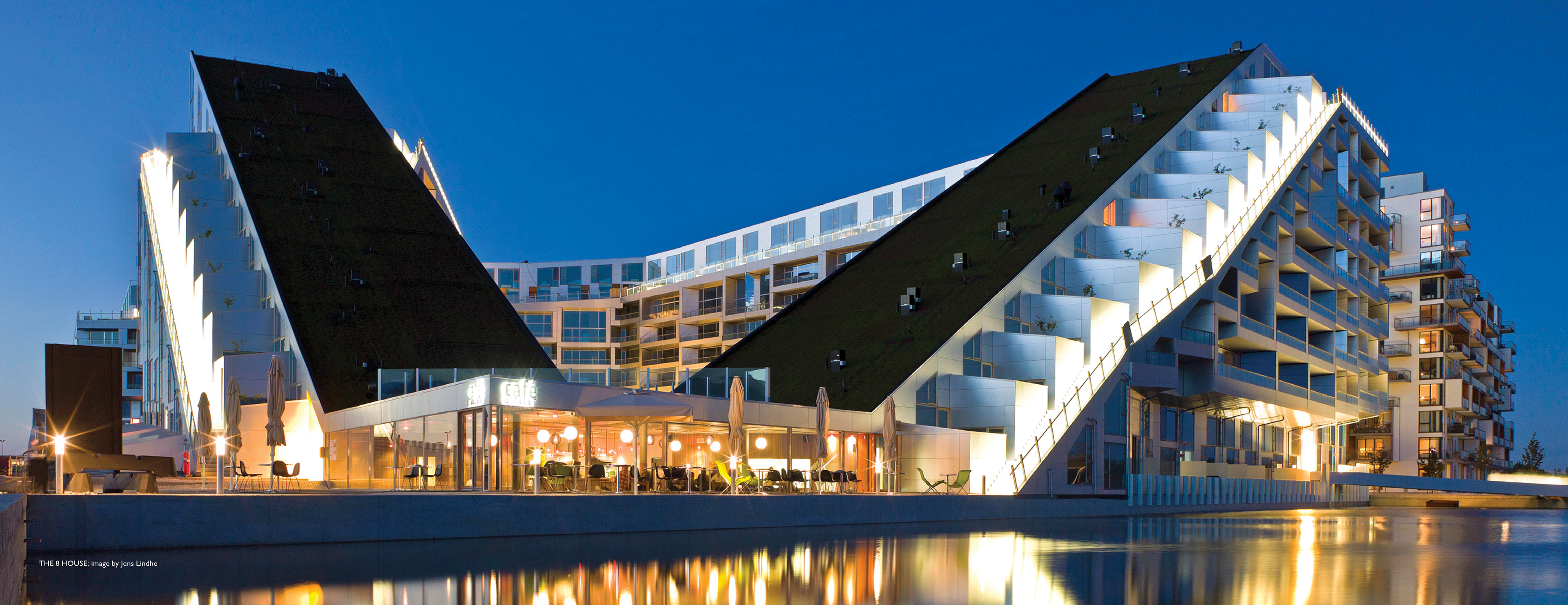
Full-image spread: An uninterrupted architectural image gives the reader a pause from explanatory content.
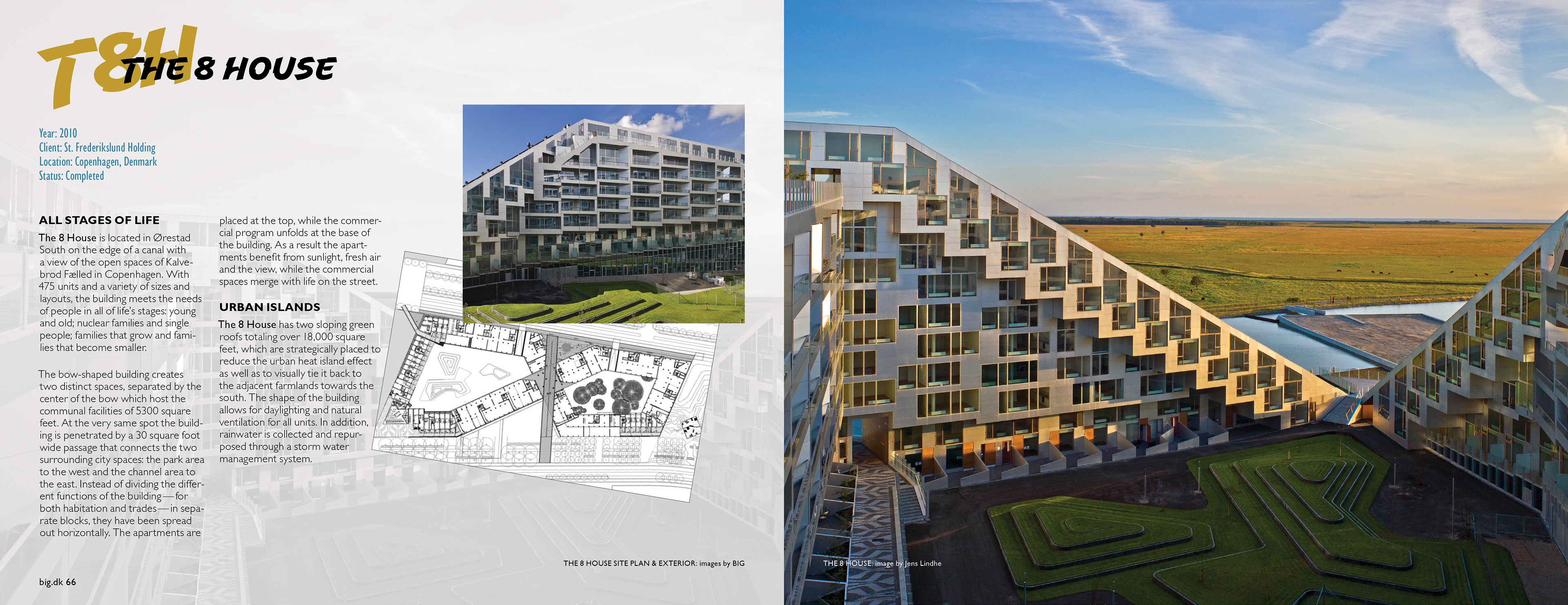
Project sequence: Plans, exterior views, and text connect building form to its urban setting.
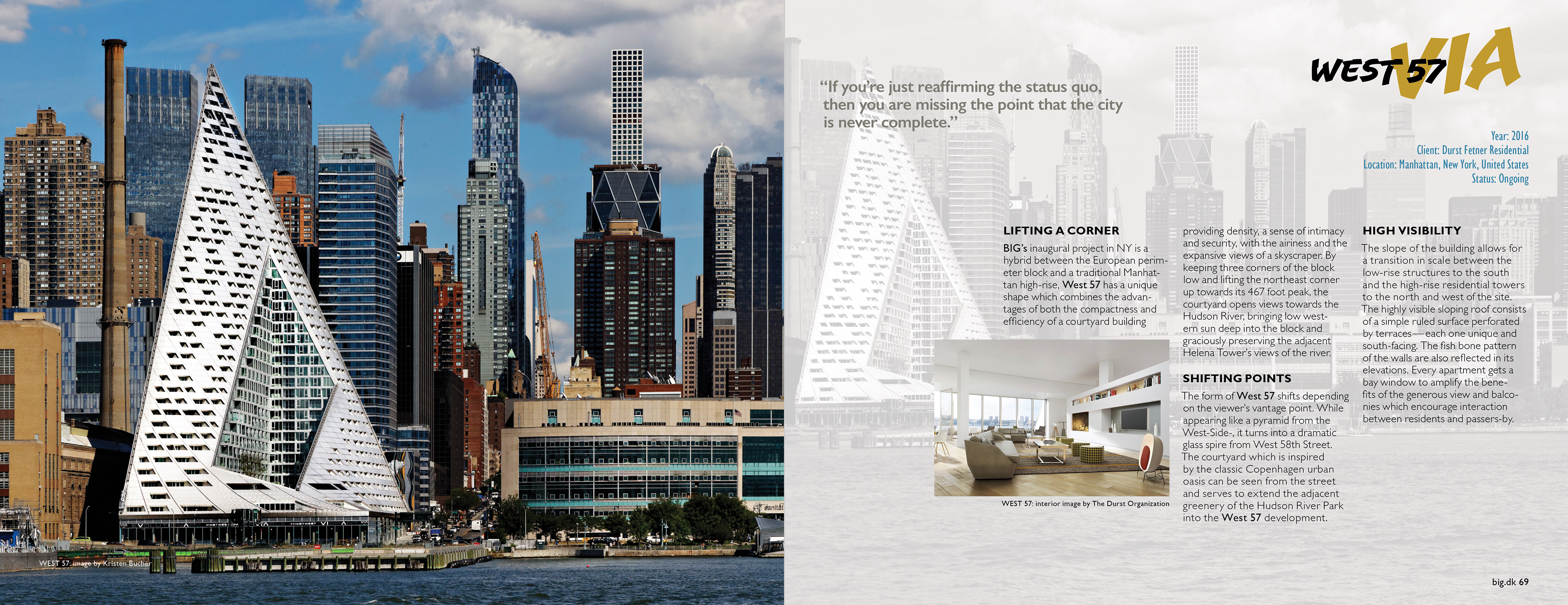
Façade spread: A dominant photograph faces a quieter text page, varying the pace of the sequence.
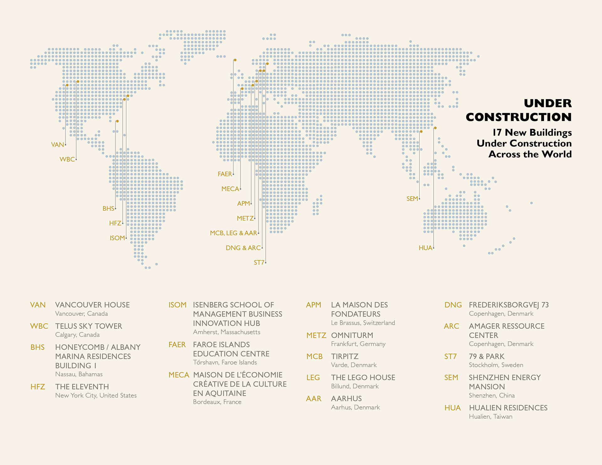
Project map: Repeated dots, coded labels, and aligned annotations organize the geographic distribution of projects under construction.

