Typographic Dissent Poster
This dissent poster investigates how typographic arrangement shapes the tone of an argument. Oversized vertical letterforms make the title a dominant visual presence. A secondary column of terms and a lower text block introduce a different pace of reading and additional levels of information.
The composition places dense letterforms against a textured field, using contrast, rotation, and stacking to create tension. Its central formal question is the relationship between immediate impact and the slower act of deciphering a message. The work treats typography as rhetoric: scale, orientation, and grouping influence how a statement is encountered as well as how it is read.
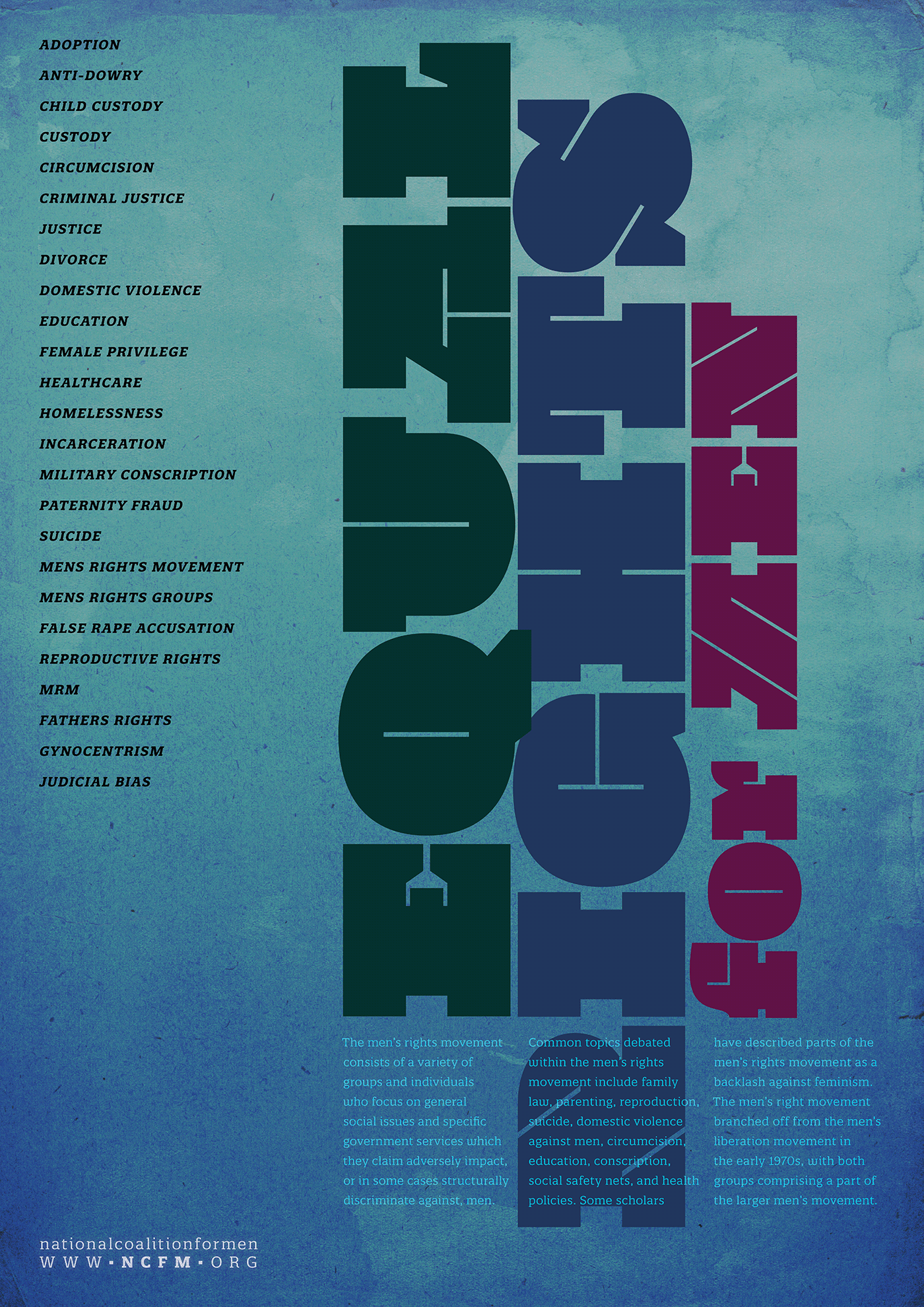
Poster: Vertical display type, modular text blocks, and a limited palette establish a confrontational tone through composition.

