Event Identity | Poster, Direct Mail, and Interface Concepts
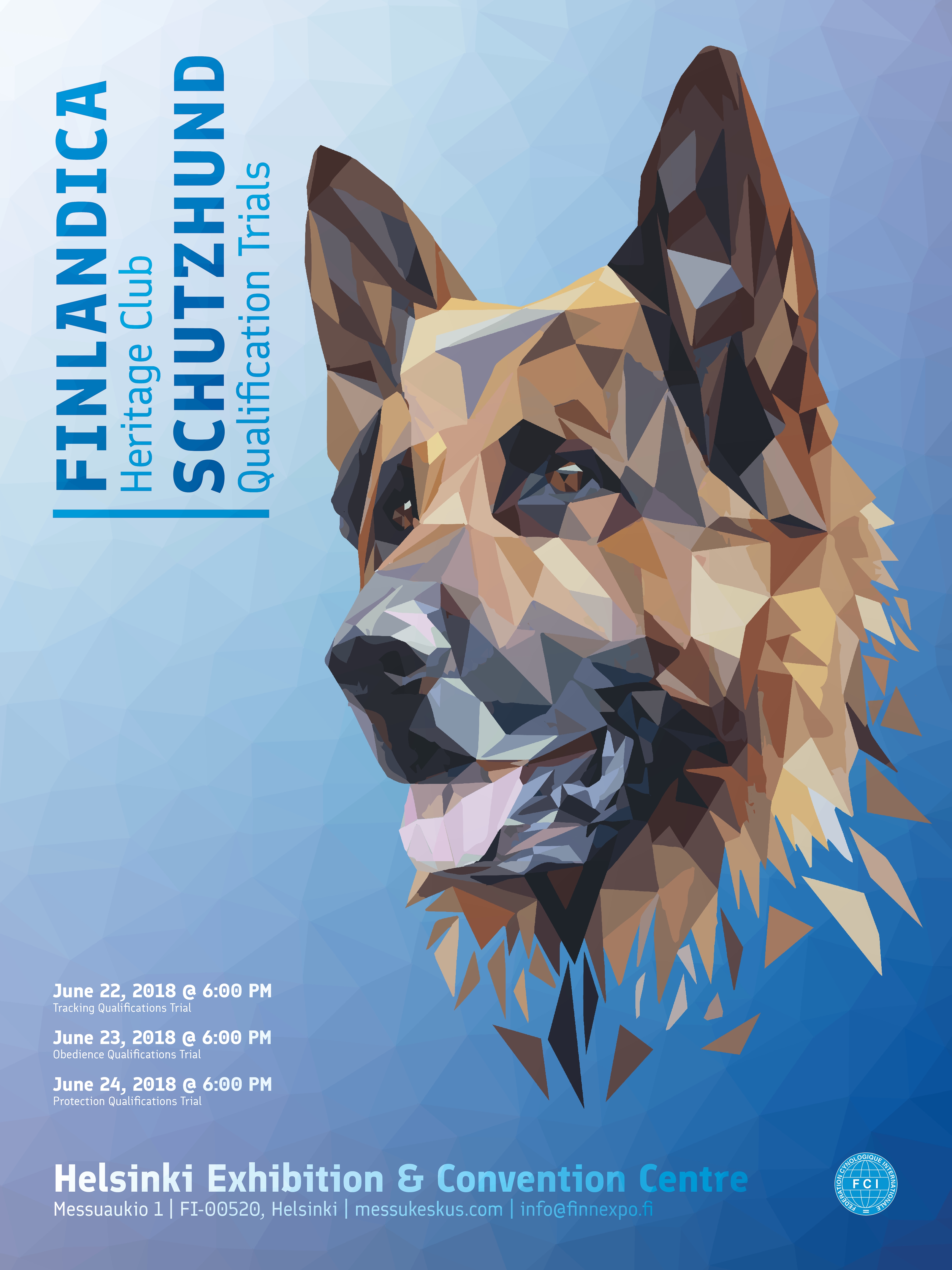
Poster: A large illustrated figure and rotated title establish emphasis, with event details grouped into distinct informational areas.
For the Finlandica Heritage Club Schutzhund Qualification Trials, I developed an event identity across a poster, postcard, and conceptual mobile screens. The identity takes its name from Finlandica, the typeface created for Finland by Helsinki Type Studio. A geometric dog portrait establishes the principal image; condensed typography and a blue-violet palette organize the surrounding information.
The design challenge was to preserve recognition as the viewing conditions changed. The poster uses dramatic scale and asymmetry to attract attention. The postcard separates invitation, registration messaging, and mailing requirements. The mobile concepts reorganize the identity around event information on a smaller screen.
Across these applications, illustration provides continuity while typography carries the functional distinctions. The project connects image-making to identity design through adaptation, rather than identical repetition of the same composition.
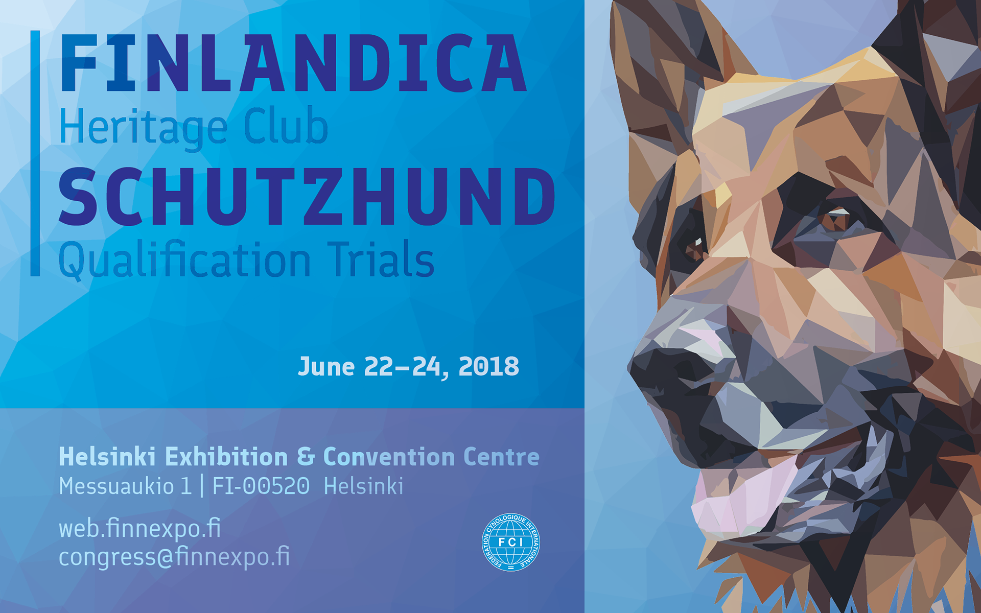
Postcard front: Cropped geometric imagery and contrasting type sizes introduce the event.
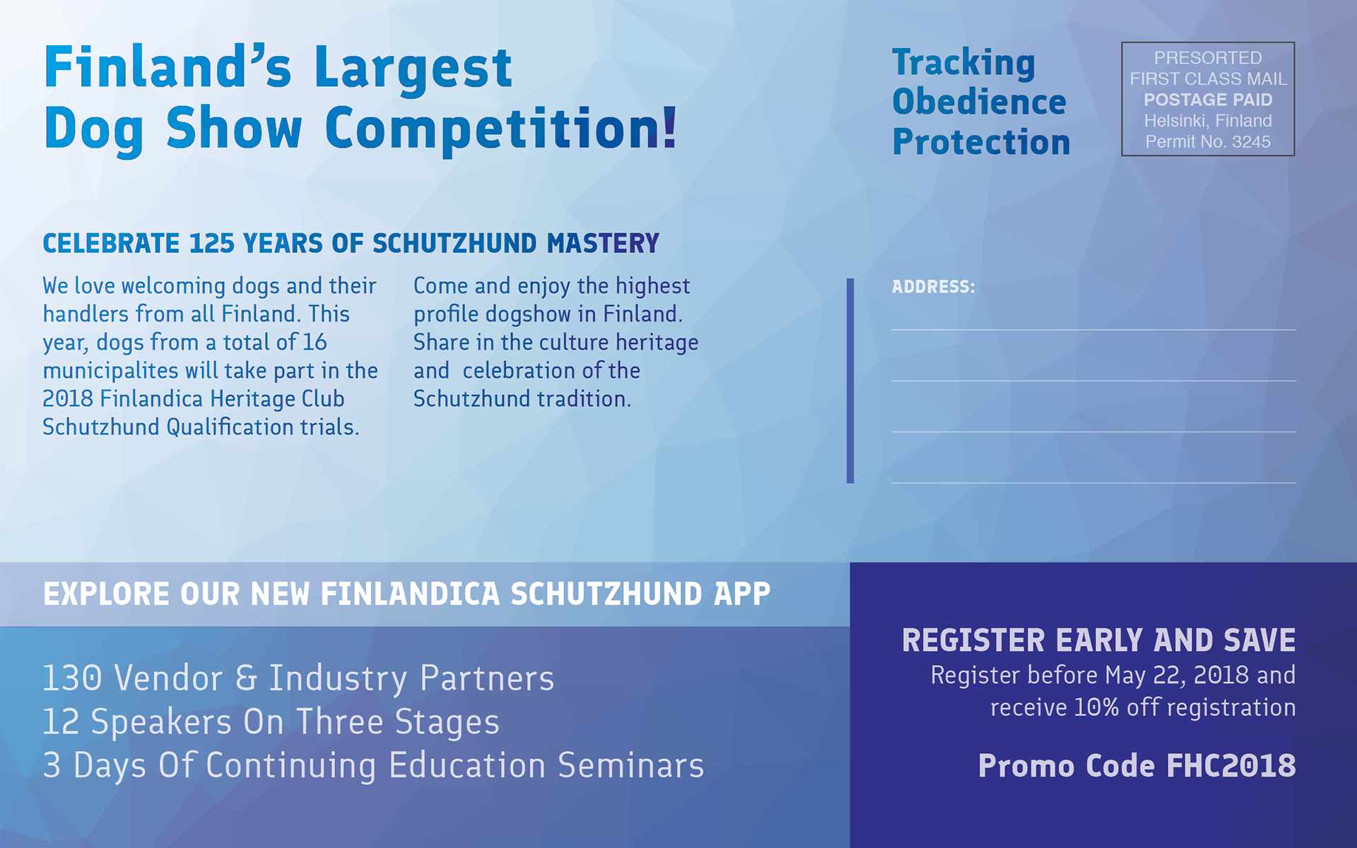
Postcard reverse: Promotional copy, registration messaging, and mailing space occupy clearly separated areas.
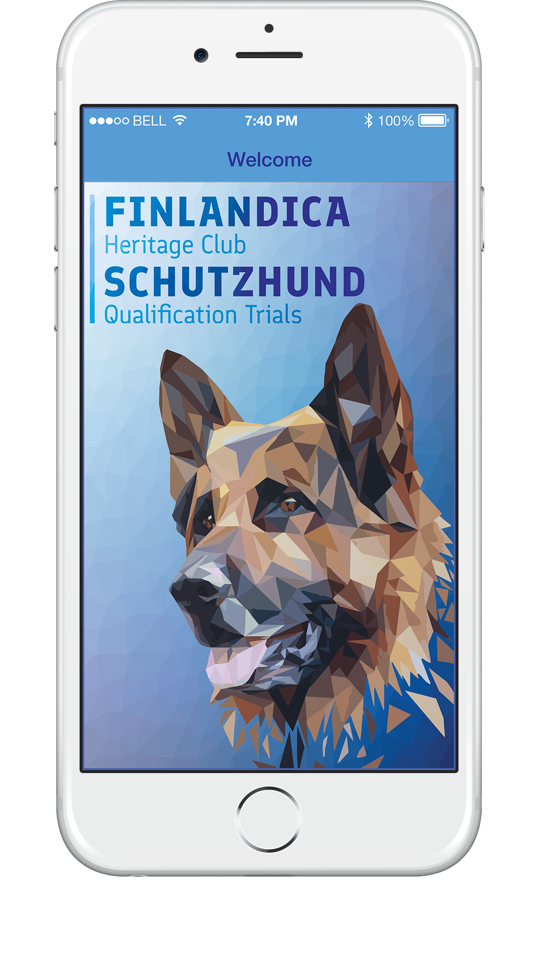
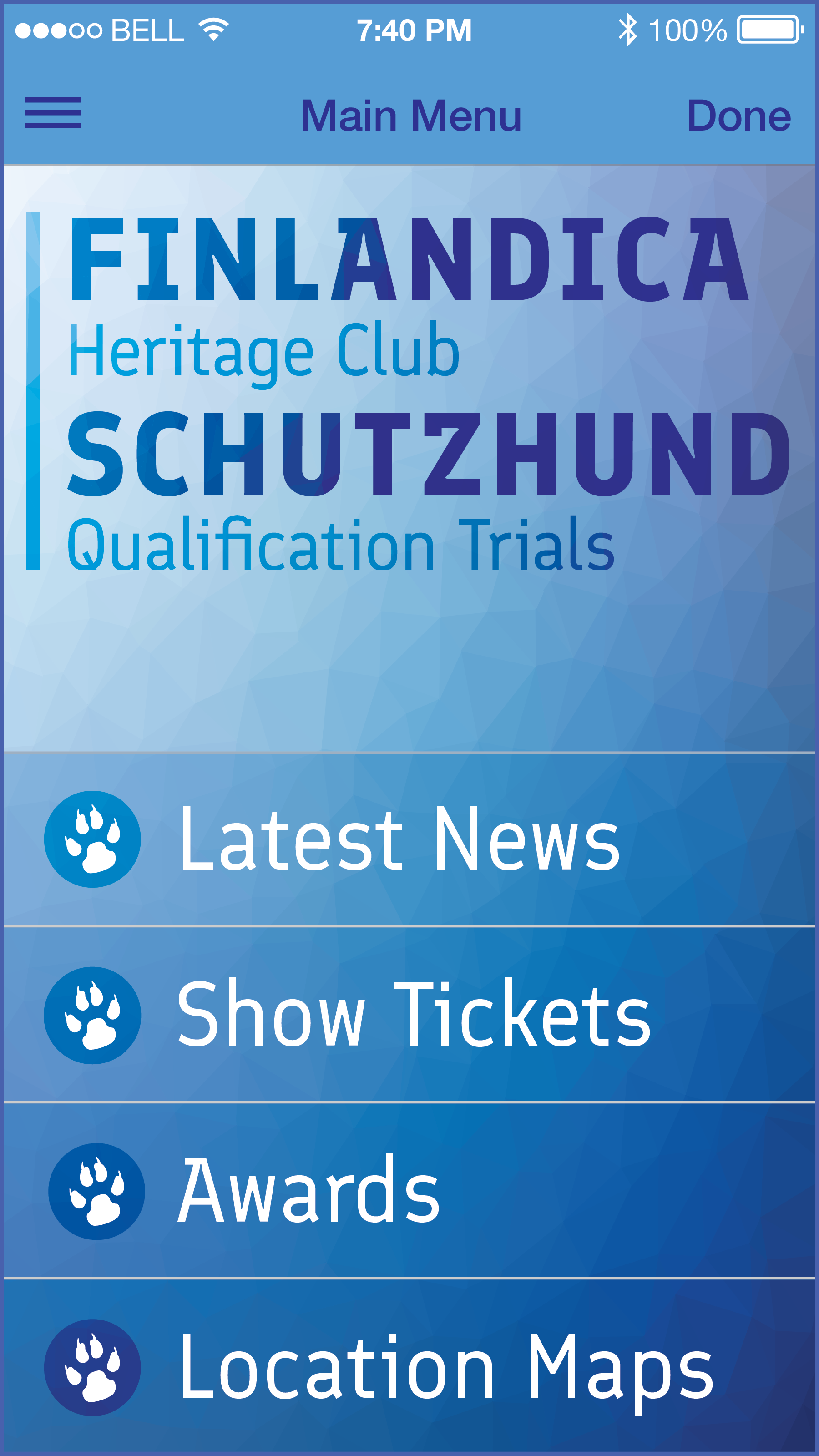
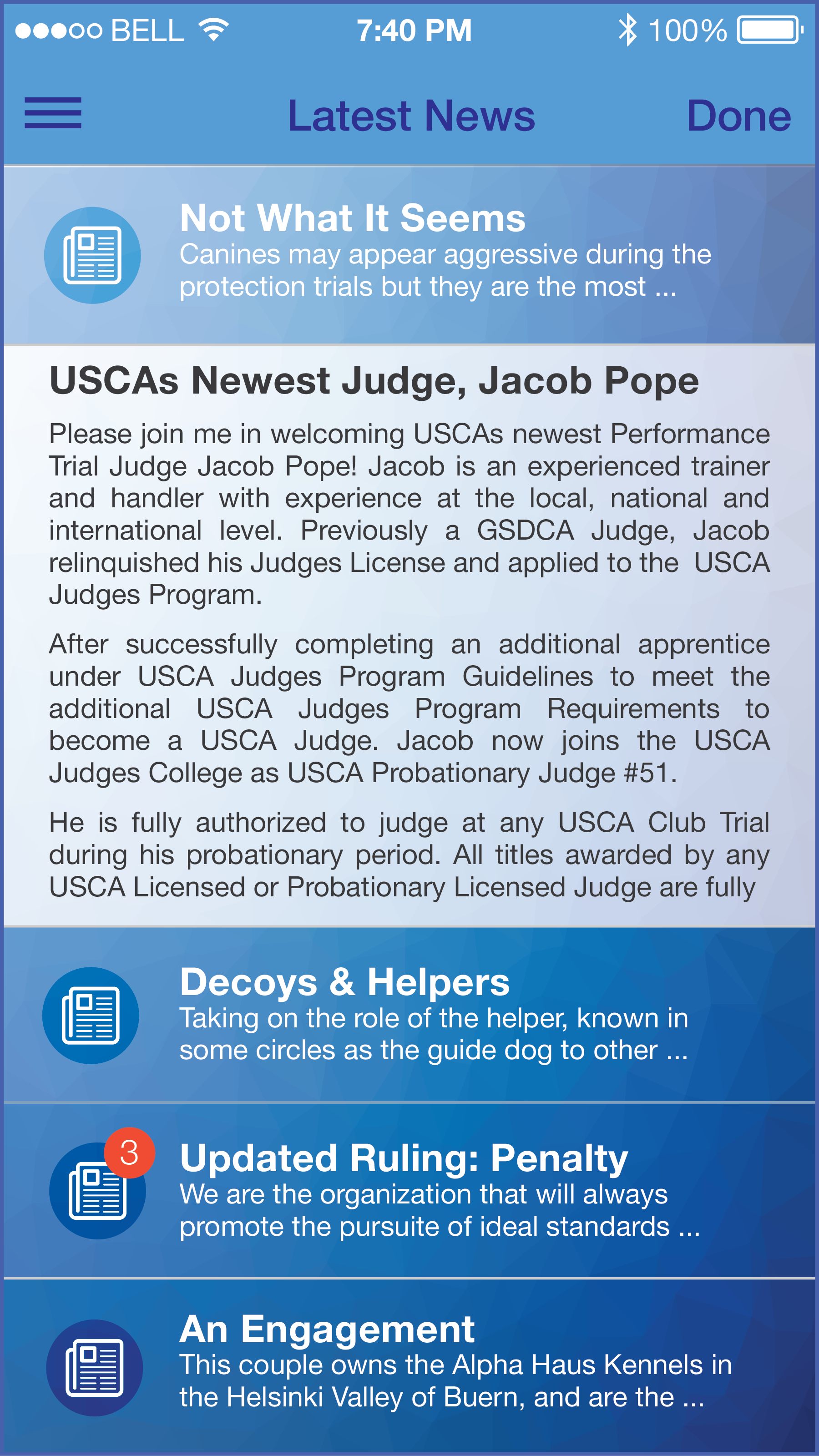
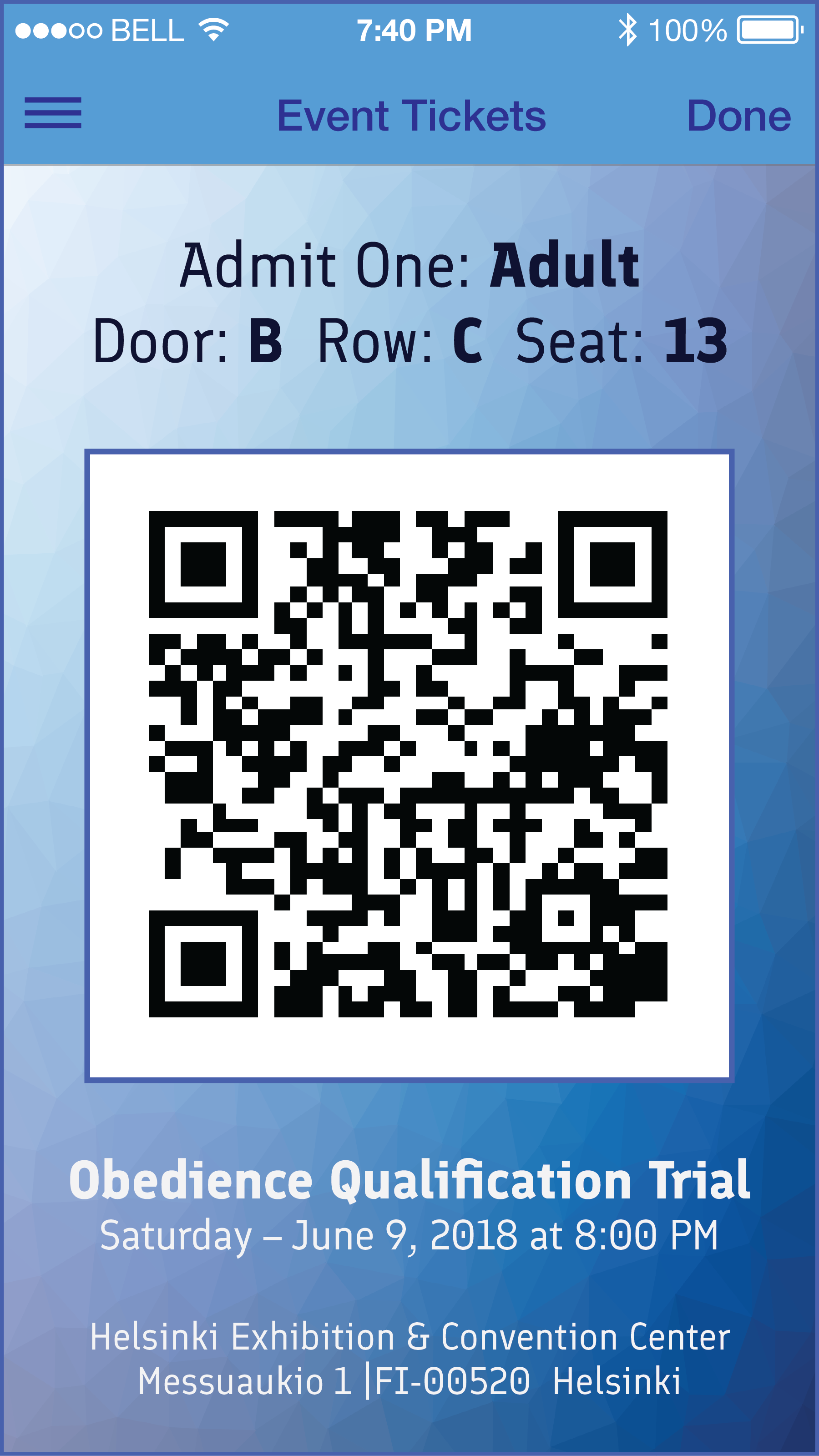
Mobile concepts: The event identity extends through a welcome screen, menu, news listing, and ticket display.

