Book Covers | Interpretation and Publication Design
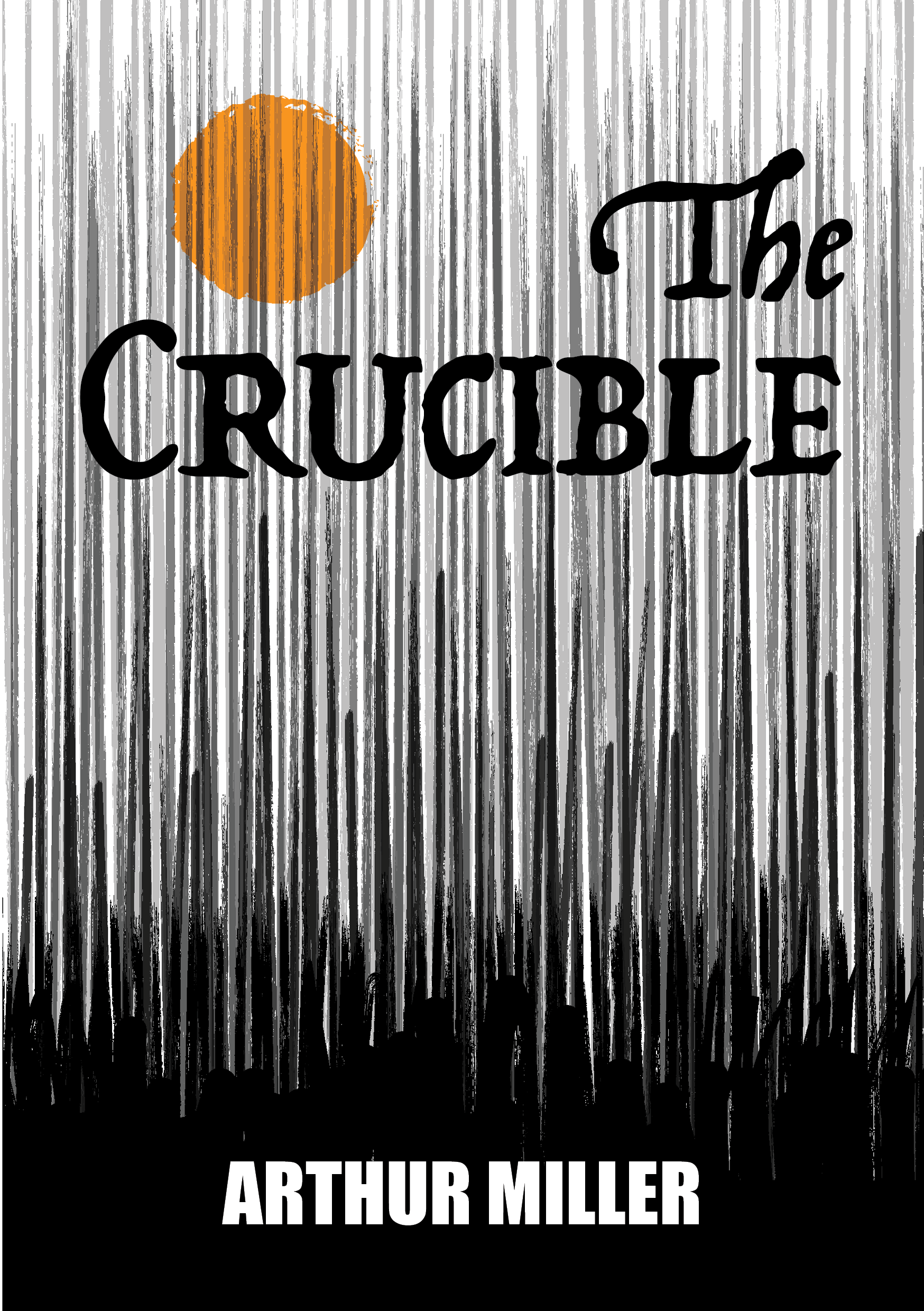
The Crucible, front: A central title and broad author band stabilize a field of distressed vertical texture.
These cover designs for Arthur Miller’s The Crucible and William Golding’s Lord of the Flies translate literary themes into concentrated visual propositions. I developed each title as an individual interpretation within a related publication series.
The Crucible uses distressed vertical marks and stark contrast to suggest tension and moral instability. Lord of the Flies uses a swarm of small flies that together form the silhouette of one giant fly, the Lord of the Flies made by the crowd, connecting the swarm to the novel’s violence and fear. In each design, the title provides a stable typographic anchor within an active image field.
The back covers shift from thematic interpretation to editorial organization. Synopsis, biography, portrait, and publication details occupy consistent informational zones. The series joins conceptual image-making to the less visible discipline of making a complete book cover function.
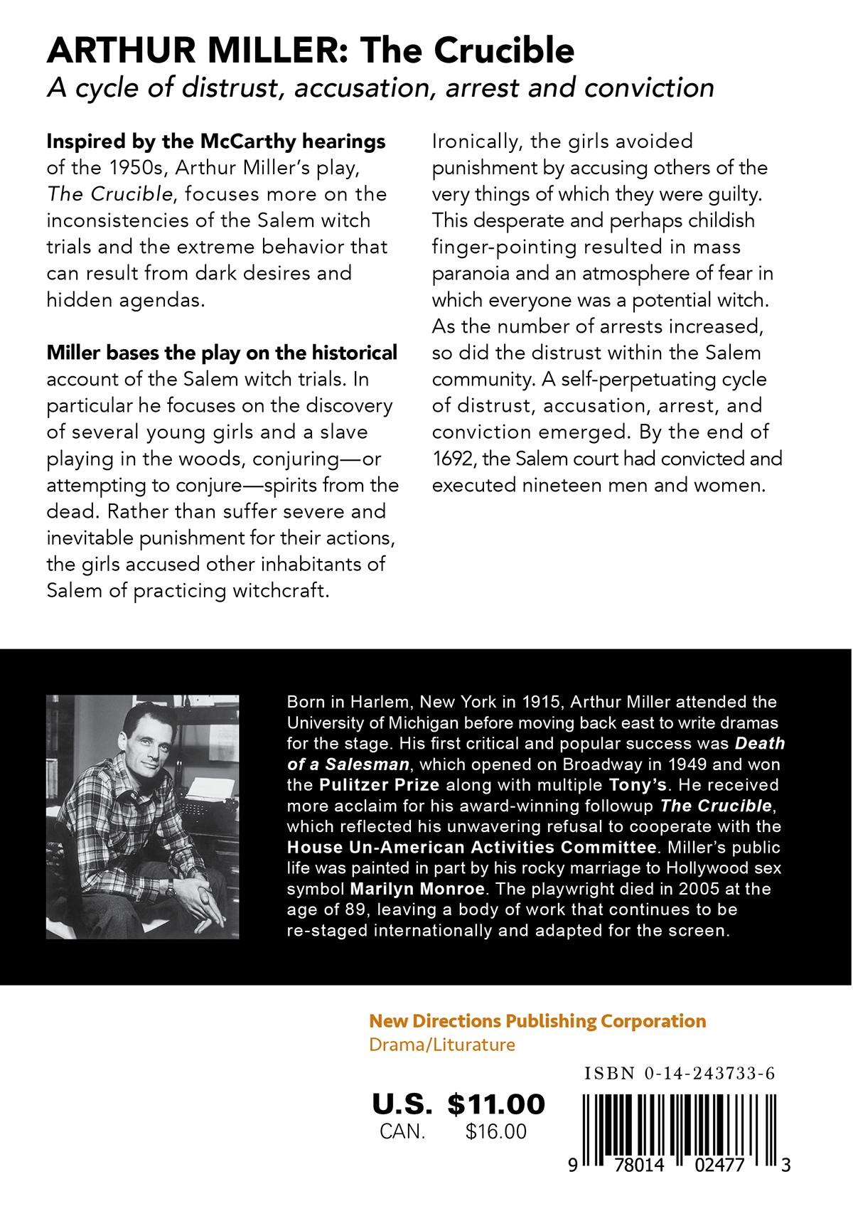
The Crucible, back: Columnar text and horizontal divisions distinguish synopsis, biography, and publication details.
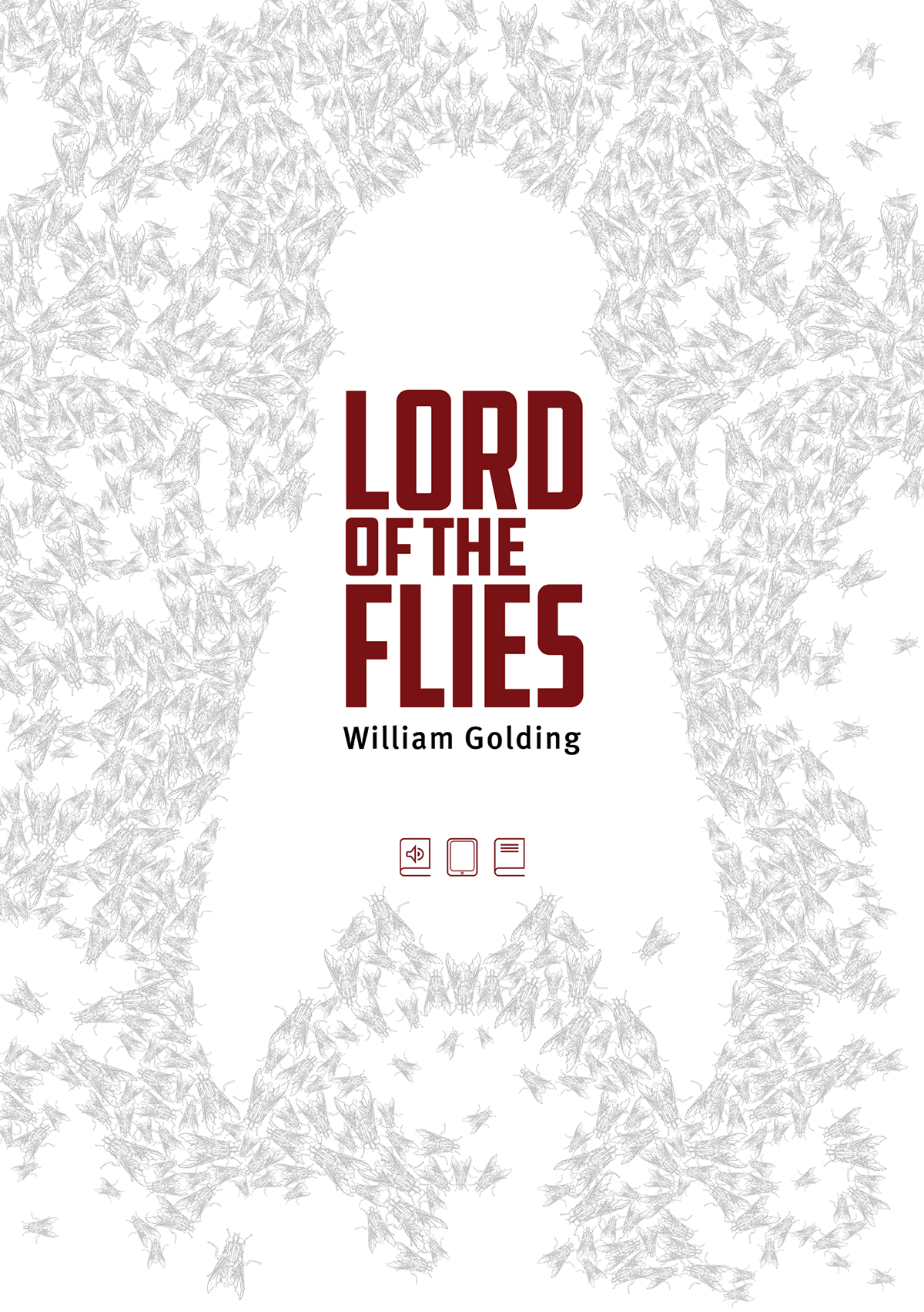
Lord of the Flies, front: A swarm of small flies forms the silhouette of one giant fly, with the red title set at the center of that silhouette.
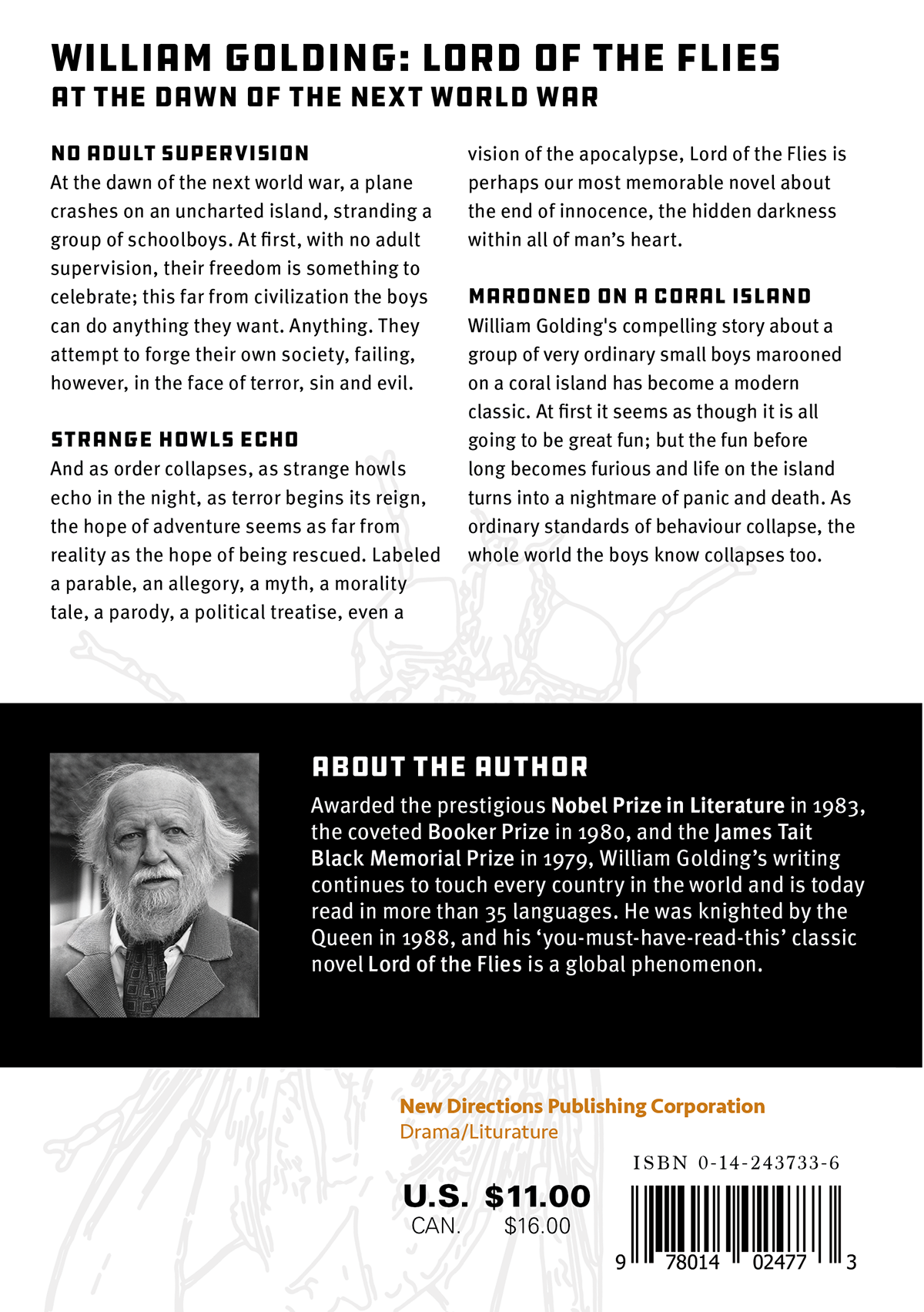
Lord of the Flies, back: Segmented text groups and a biography band extend the front cover’s visual language into an informational layout.

