Custom Lettering | Identity Development
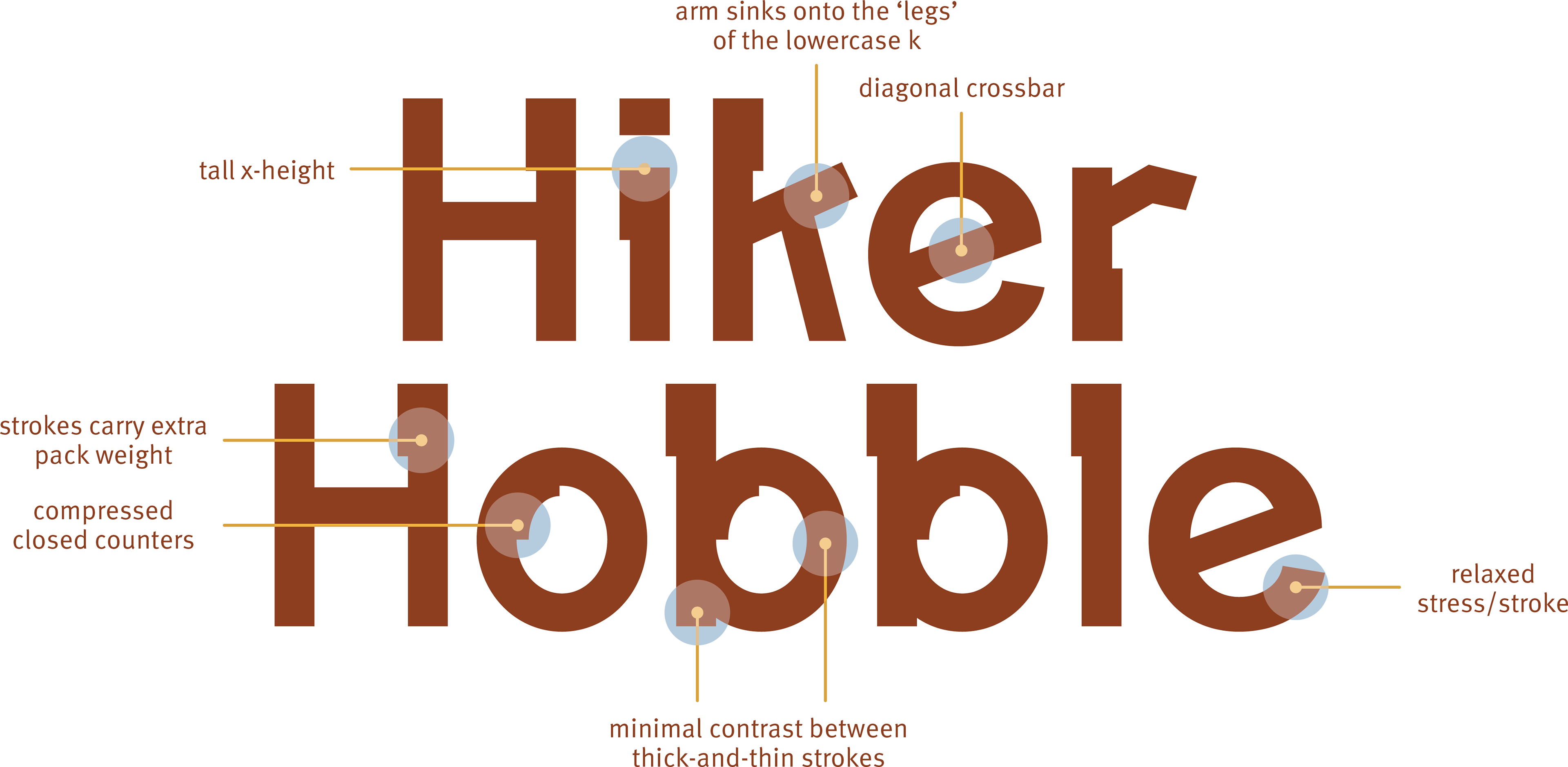
Annotated study: Formal details identify the letterforms’ shared construction and expressive character.
Hiker Hobble explores how a wordmark can express a particular voice through the construction of its letters. Sturdy forms suggest weight and durability, while irregular crossbars, compressed counters, and relaxed transitions introduce an intentional sense of instability.
I developed the lettering through vector construction and adjustments to proportion, stroke relationships, counters, and spacing. Outline studies make those decisions visible; size tests examine how the wordmark changes as its distinctive details become more or less prominent.
The project treats lettering as a coordinated set of relationships. Its character depends on the rhythm of the complete name as much as on the distinctive features of individual letters.
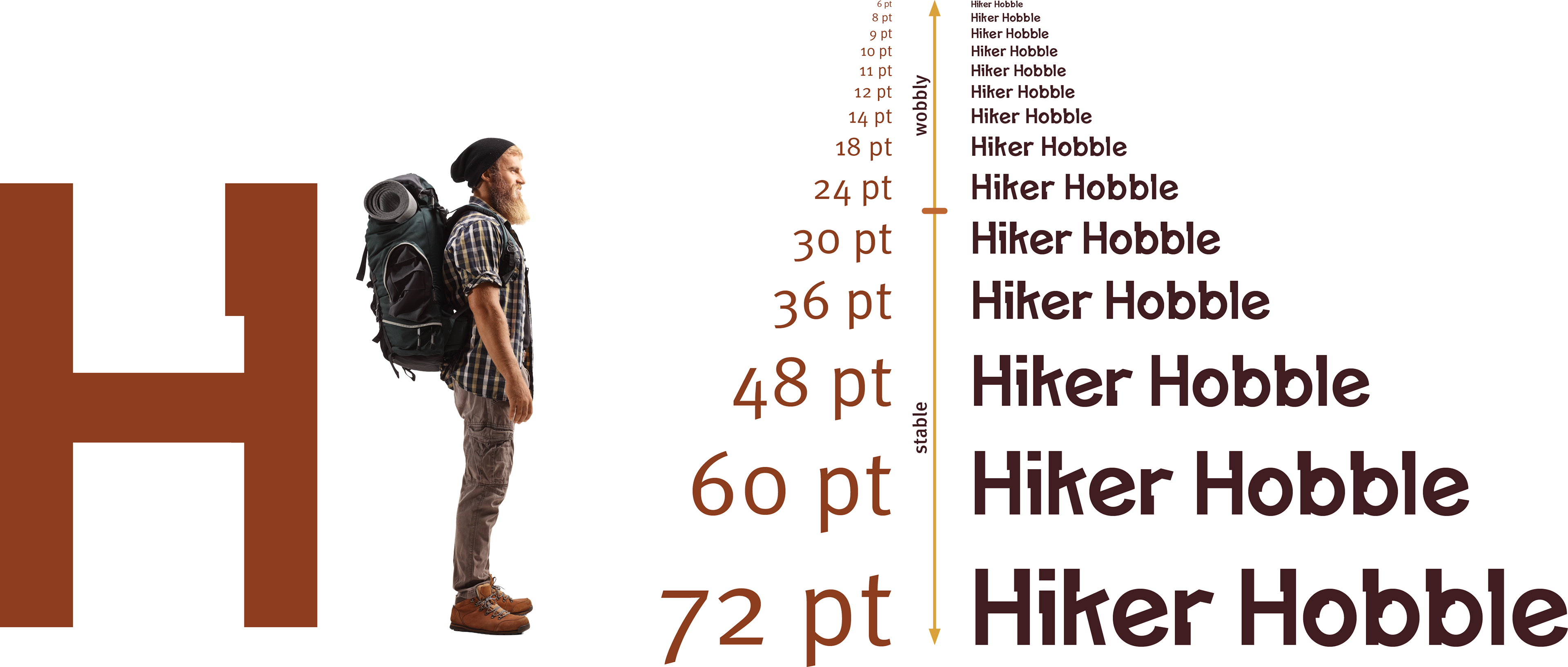
Size tests: Repeated settings examine the relationship among scale, spacing, and the visibility of distinctive features.
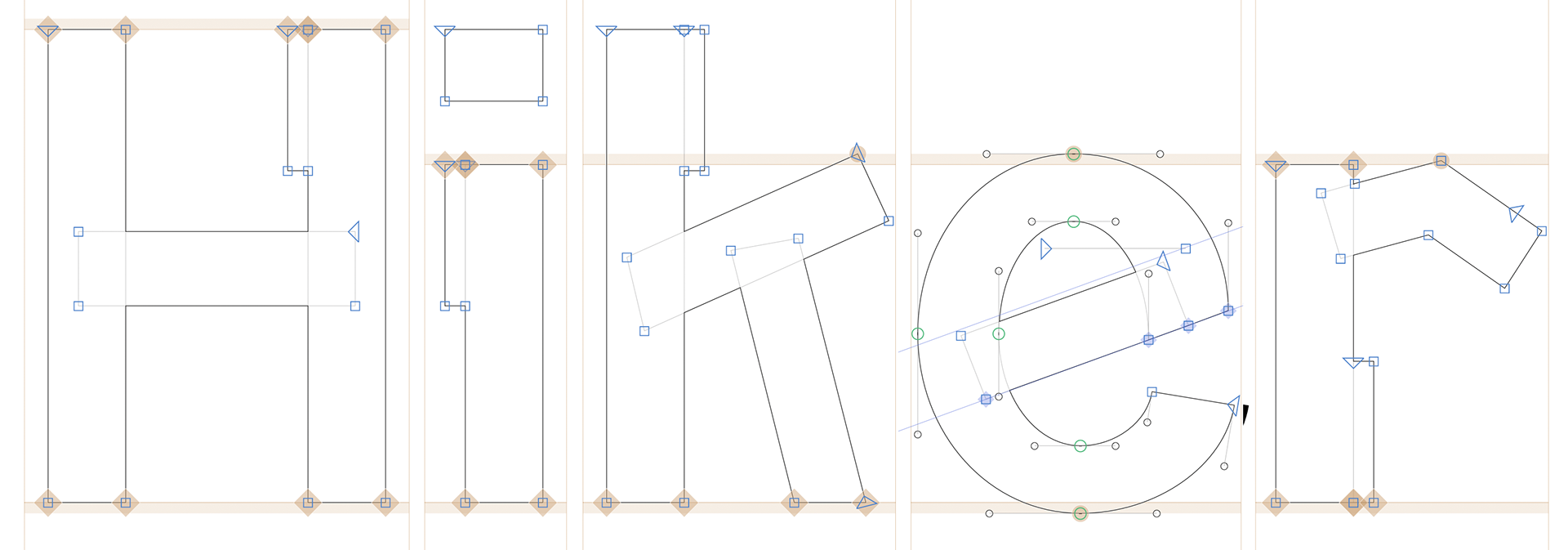
Hiker outlines: Vector contours document the construction of stems, counters, and curves.
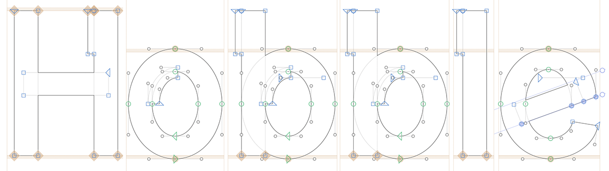
Hobble outlines: Related structural decisions carry the lettering’s rhythm across the second word.

