Magazine Feature | Editorial Design and Information Graphics
This magazine feature examines how editorial design can give readers several points of entry into a complex policy subject. I designed the complete layout for an article in GOOD Magazine on North American trade relations, organizing it as a sequence of headline, image, explanatory text, and information graphics, and I drew all of the information graphics myself.
The opening spread uses oversized typography, photography, and a restricted red, black, and gray palette to establish the subject. Interior pages shift to a modular column structure that accommodates sustained reading and comparative graphics. Changes in image scale and page density distinguish the opening, analytical sections, and conclusion without fragmenting the article.
The work centers on editorial judgment: deciding what should command attention, what should support it, and how the reader should move between an argument and its visual explanation.
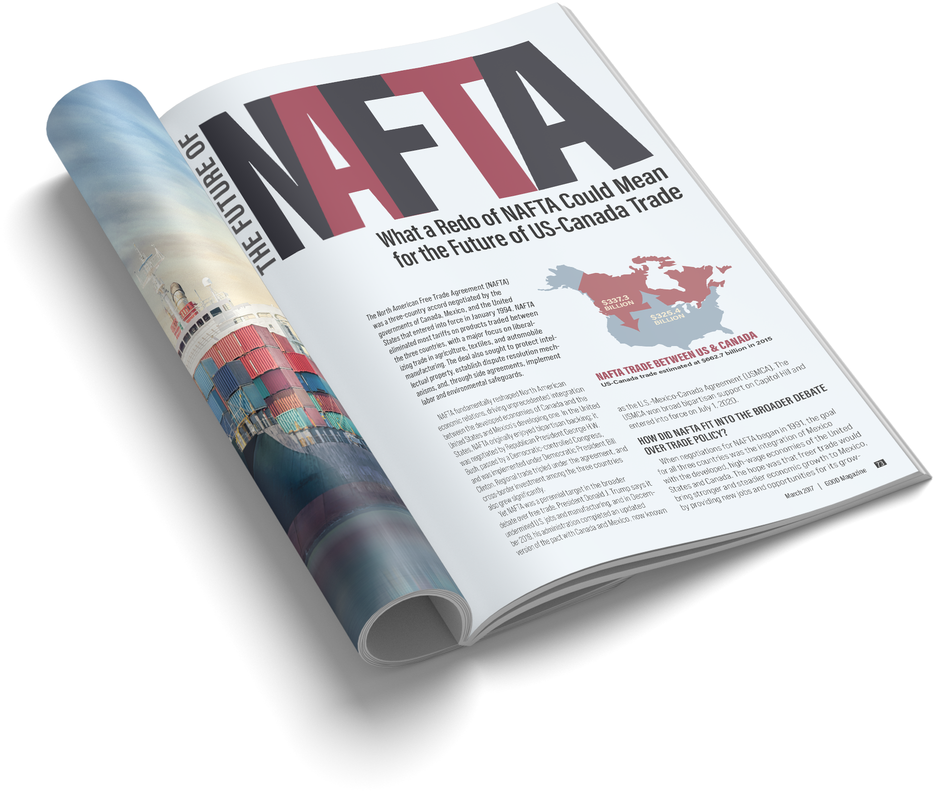
Publication mockup: The opening spread shown at the scale and proportions of a magazine.
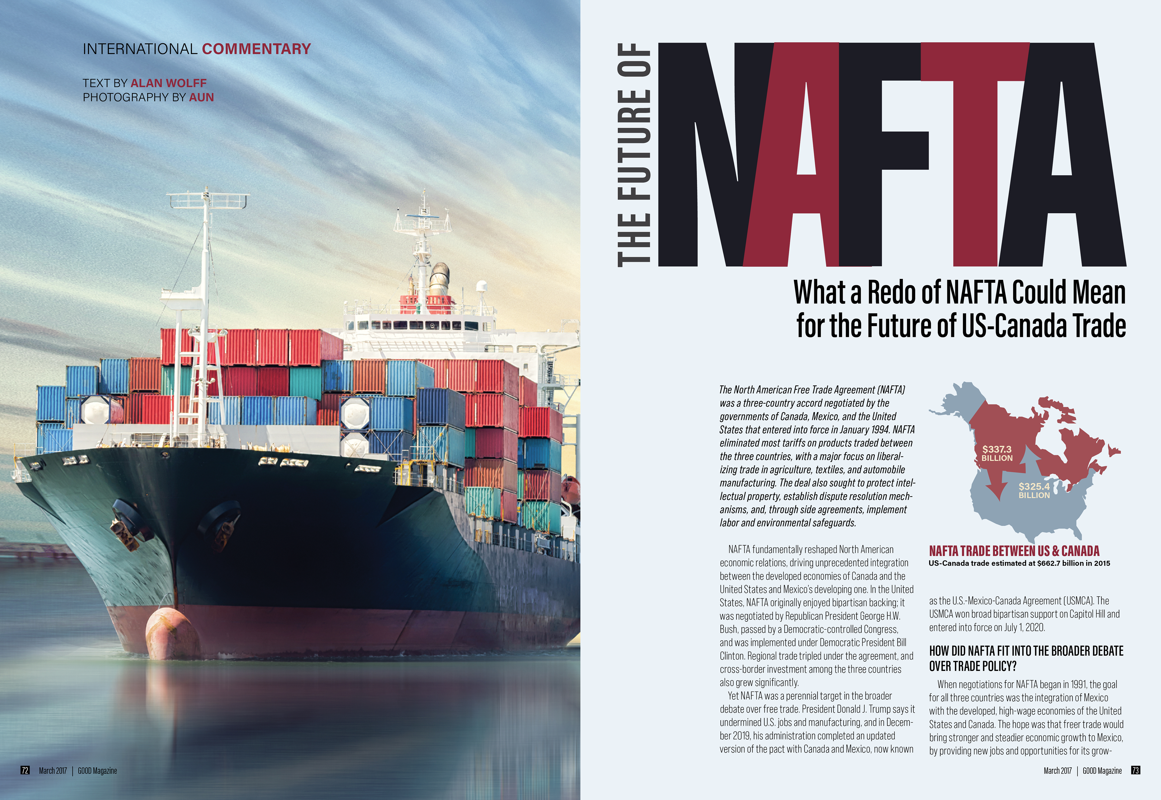
Opener: Full-bleed photography and large display type establish the feature’s principal entry point.
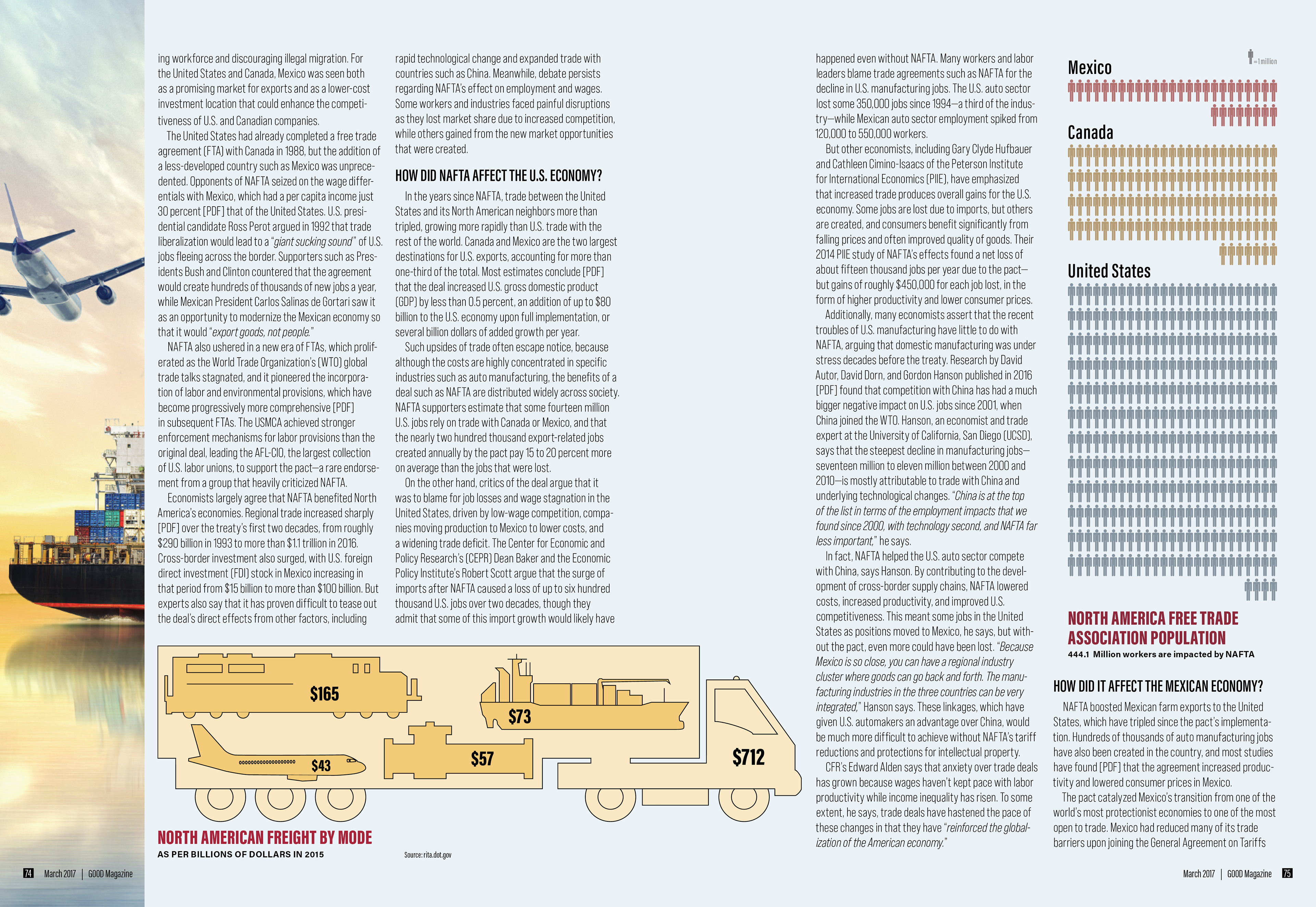
Analytical spread: A horizontal information graphic shares a consistent column structure with the article text.

Conclusion: A quieter text field and contained author portrait mark the article’s close.

