Display Alphabet | Letterform Development
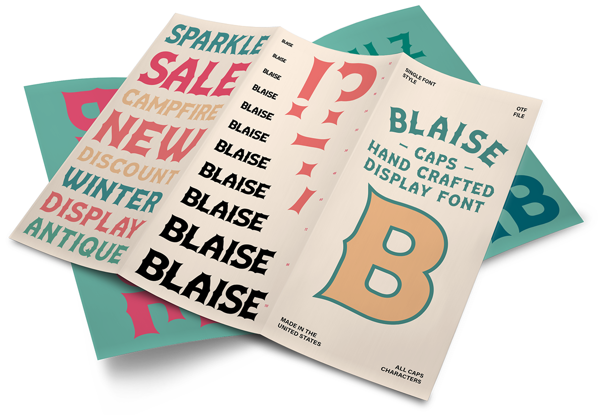
Specimen brochure: Display settings and feature callouts introduce the alphabet across several scales.
Blaise is an uppercase display alphabet organized around pointed spurs, tapered terminals, and sculpted interior forms. Flame-like shapes and rounded crossbars connect the alphabet to its campfire origins. The investigation asks how a small number of structural ideas can generate a coherent set of letters without making every character behave identically.
The project materials document hand-drawn explorations, vector development, and comparisons among recurring forms. Adjustments to proportion, weight, and counters reconcile the alphabet’s ornamental details with its broader rhythm. Specimen pages bring the characters into word settings and different scales, where consistency can be examined beyond an isolated glyph.
The work presents type design as a process of comparison and revision: character emerges through variation, while cohesion depends on deciding which relationships must remain stable.
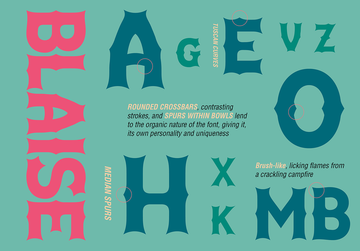
Detail sheet: Selected glyphs isolate recurring spurs, crossbars, curves, and bowls.
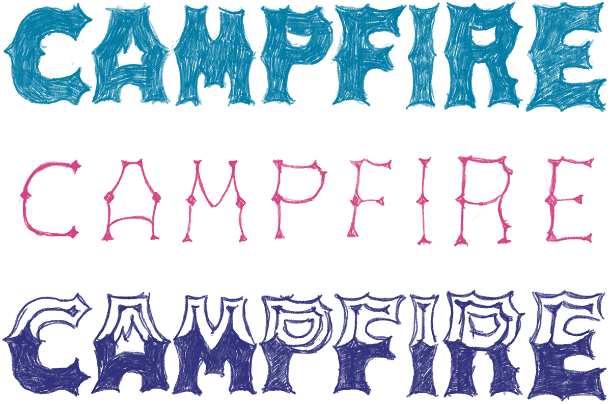
Sketch studies: Drawn alternatives document the development and regularization of structural motifs.
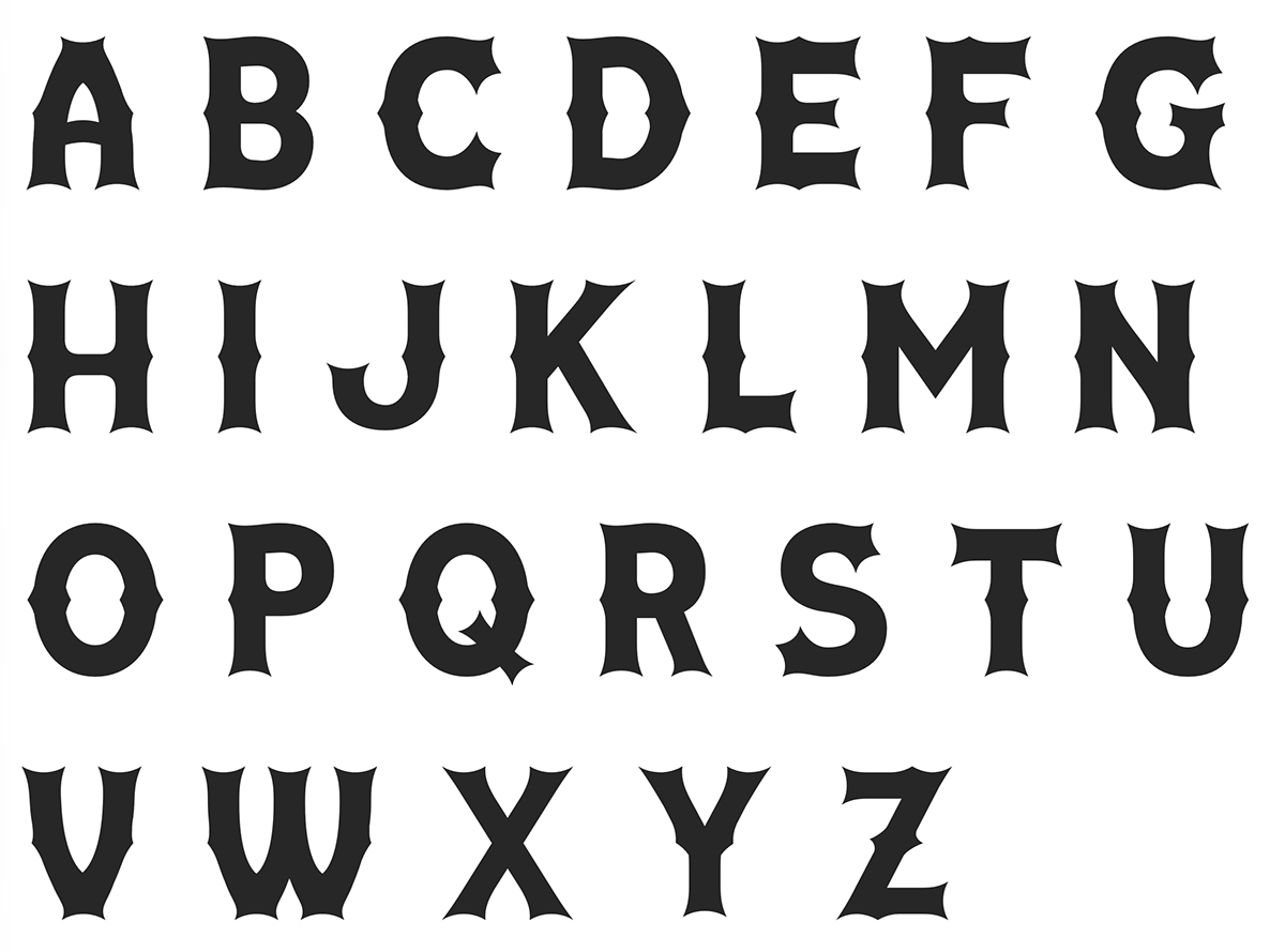
Alphabet specimen: The uppercase set brings proportion, spacing, and recurring stroke relationships into a single view.

