Display Typeface Study | From Wordmark to Character Set
Happitold extends the lettering developed for the Hiker Hobble podcast identity into a broader display-type study. Moving beyond the original name required testing whether its rounded forms, angled joins, and weighted terminals could support an expanded character set.
Uppercase and lowercase sheets, punctuation, word tests, and specimen layouts examine the consistency of those features across different combinations. The informal tone remains central, but the expanded set introduces questions that a single wordmark cannot resolve: spacing between unfamiliar pairs, variation in character width, and recurring relationships between positive and negative form.
Applied identity studies return the typeface to a communication context, connecting the close work of letterform development to tone, hierarchy, and recognition.
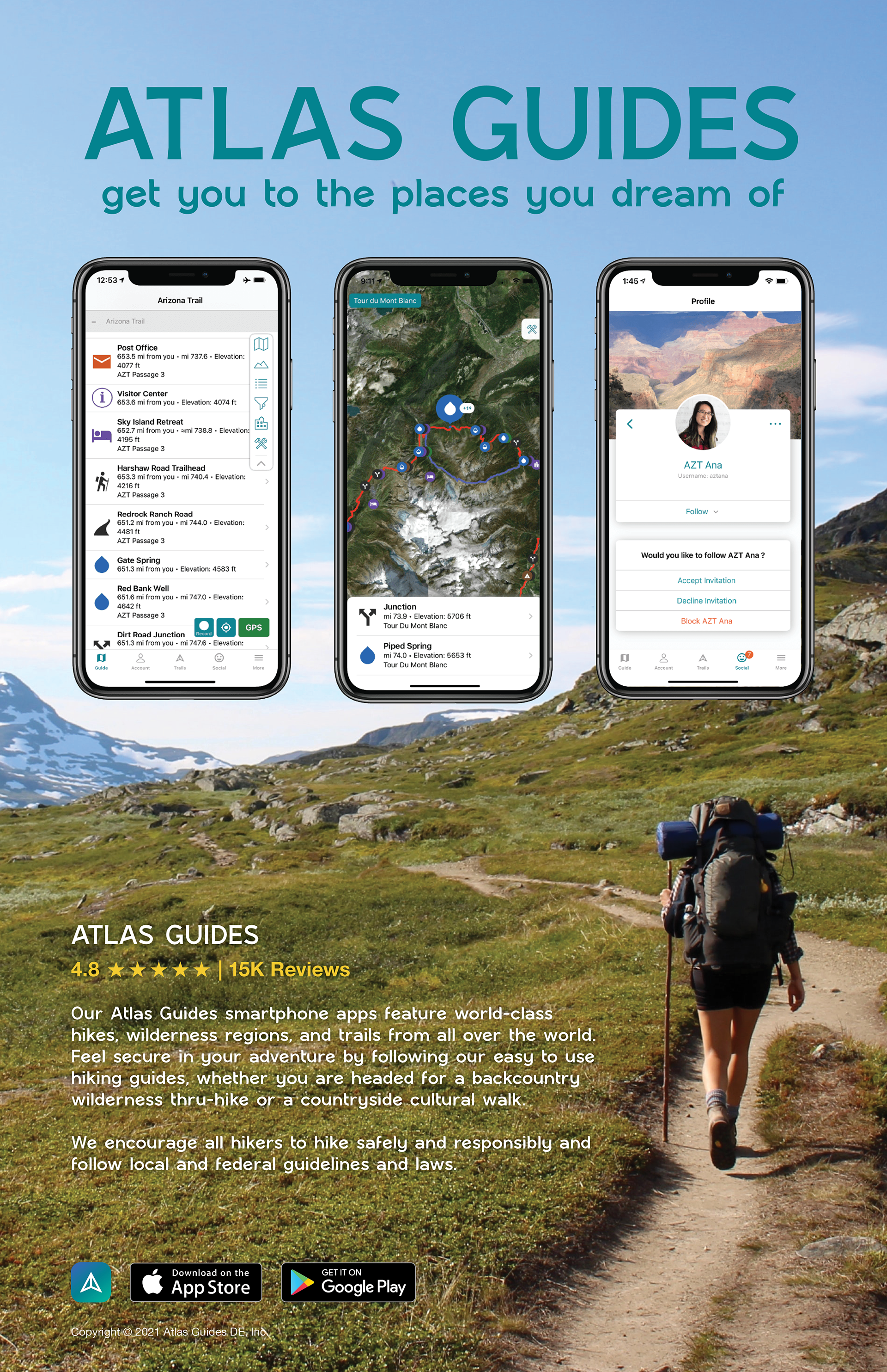
Promotional application: An Atlas Guides composition places the typeface alongside trail imagery and mobile app screens.
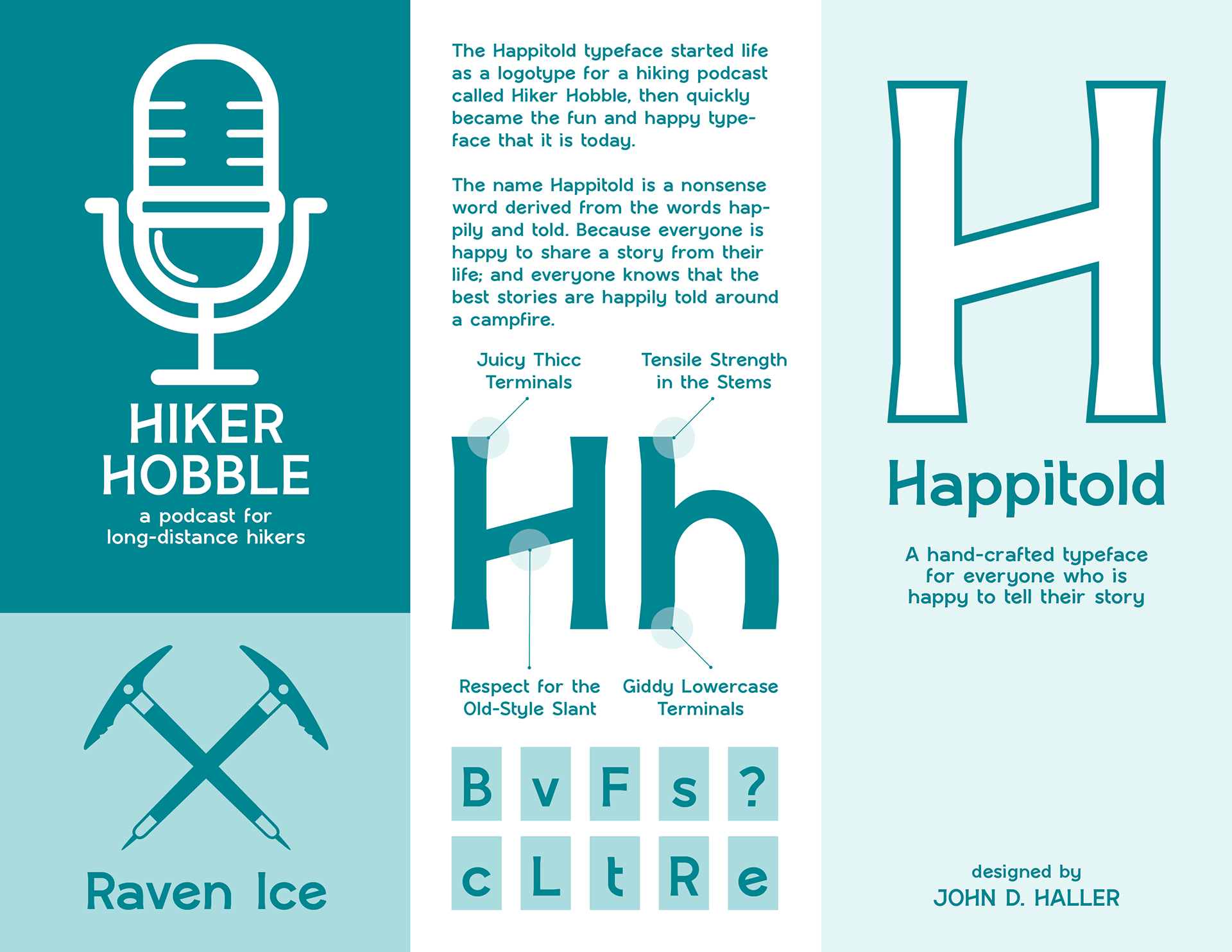
Specimen exterior: Podcast identity elements and feature callouts introduce the typeface and its origin.
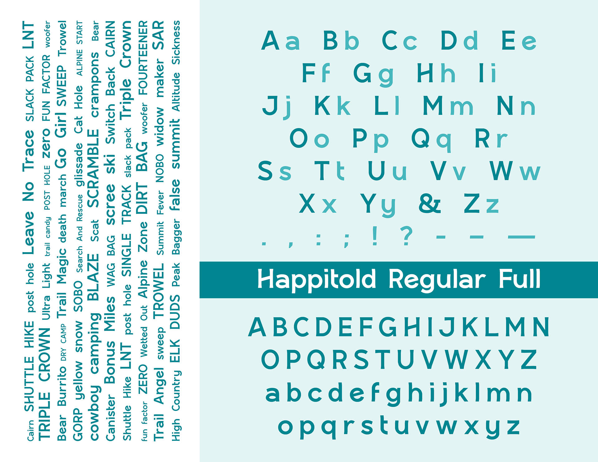
Specimen interior: Character sets, punctuation, and word tests bring recurring construction decisions into view.
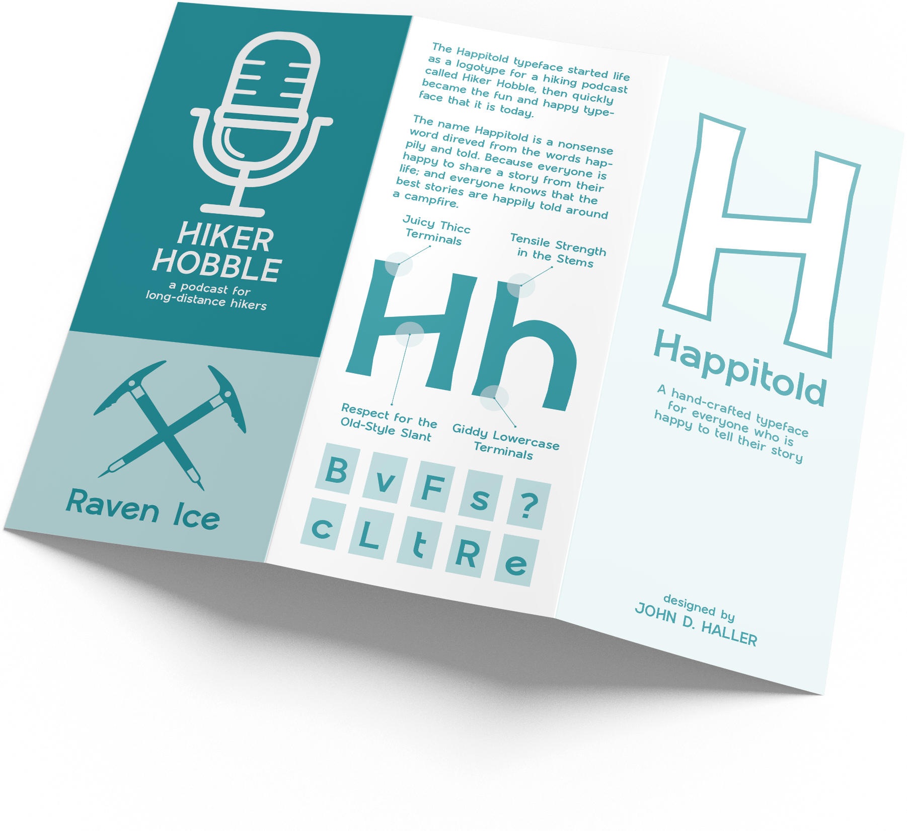
Folded specimen mockup: The specimen shown as a physical sequence of panels.
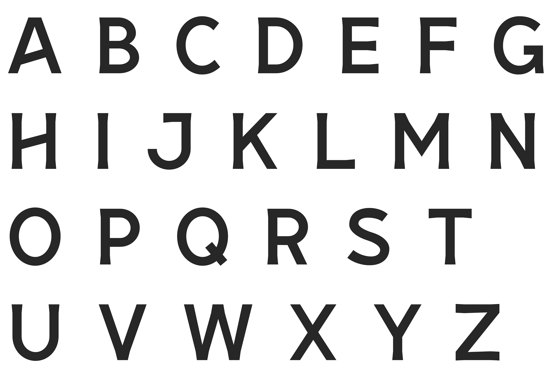
Uppercase sheet: Capital forms presented for comparison of proportion and stroke structure.
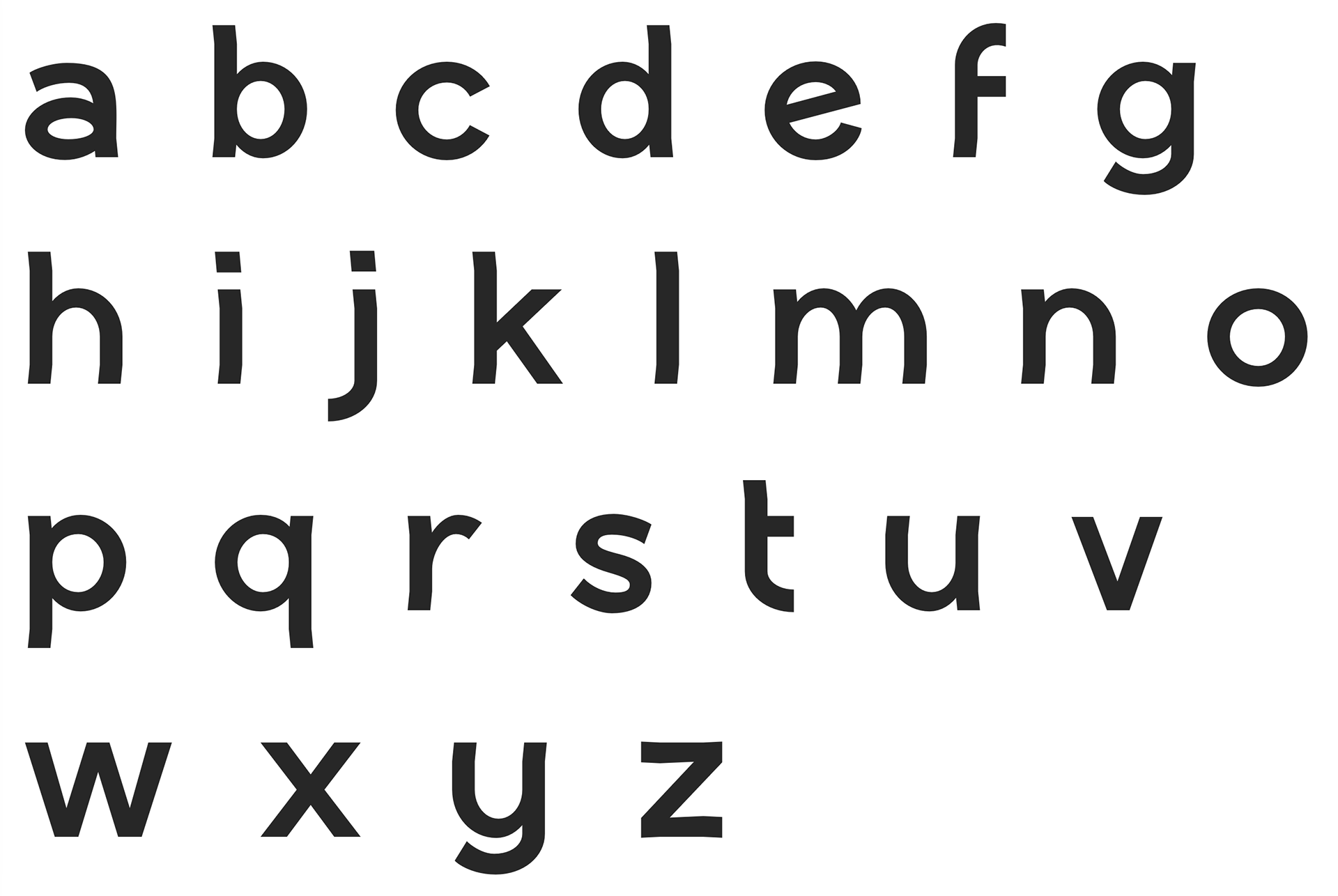
Lowercase sheet: Lowercase forms extend the study of rounded shapes, angled details, and terminals.

