Academic Event Poster | Typography in Public Space
This lecture-series poster uses typography as both subject and medium. I paired an oversized vertical display element with a compact schedule, creating a composition intended to attract attention at a distance and support closer reading of names, dates, and locations. The concept came from a person speaking at a lecture: the sound wave of a voice inspired the final layout, in which the micro-type schedule lines run along a timeline of sorts beside the yellow rule.
The difference in scale establishes the primary hierarchy. Changes in weight, spacing, and alignment organize the more detailed information, while dark neutrals, white, and saturated yellow hold the composition together. A transit-shelter mockup extends the study into an environmental context. The work explores how a reduced set of elements can accommodate both an emphatic public presence and a detailed academic announcement.
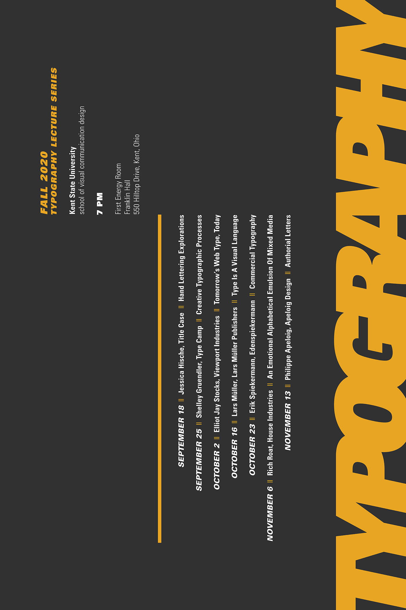
Poster: Contrasts in scale and orientation separate the display typography from the event schedule.
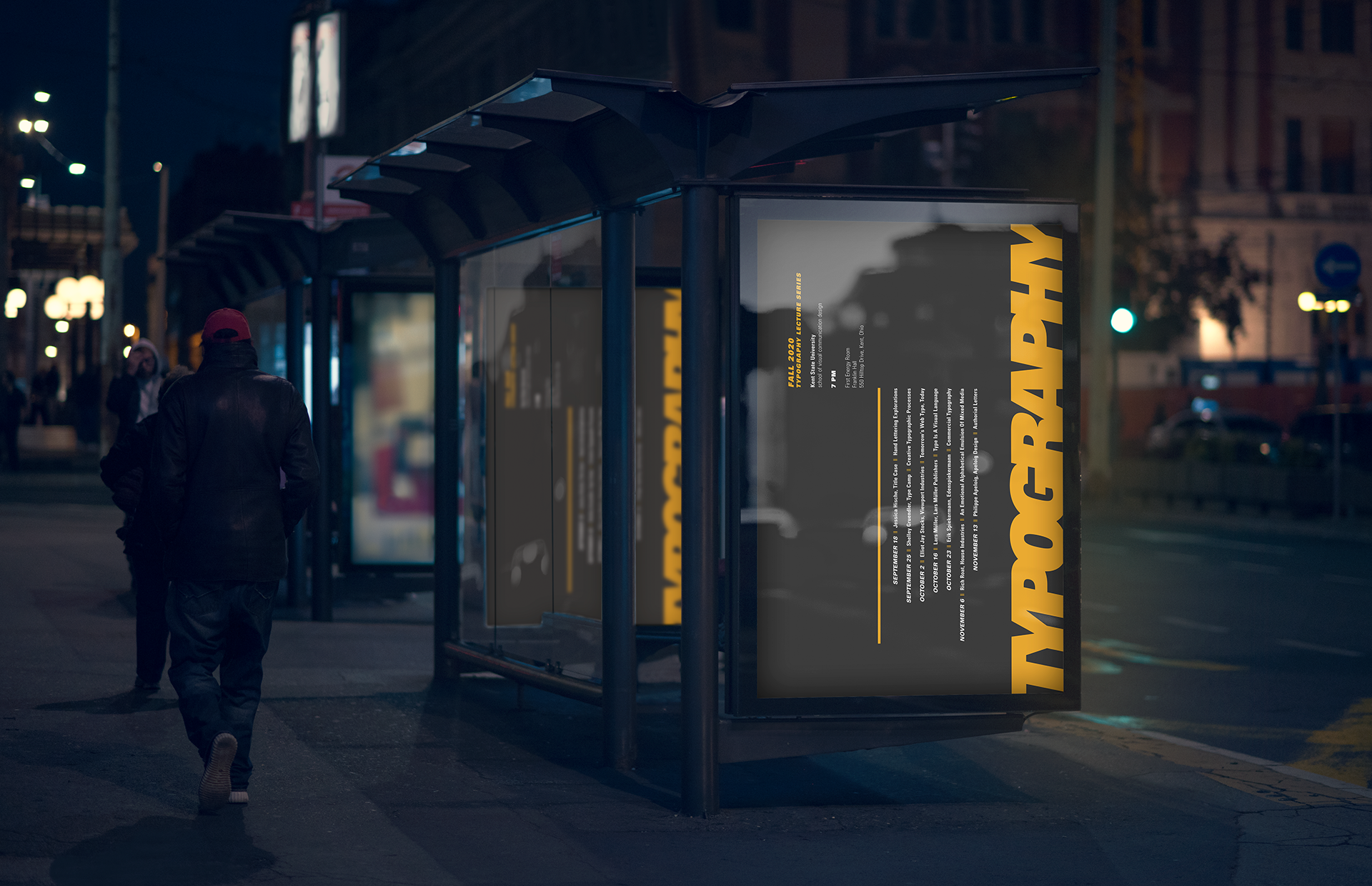
Shelter mockup: The poster shown in a public setting to examine its relationship to viewing distance and physical scale.

