Conference Brochure | Editorial Design and Typography
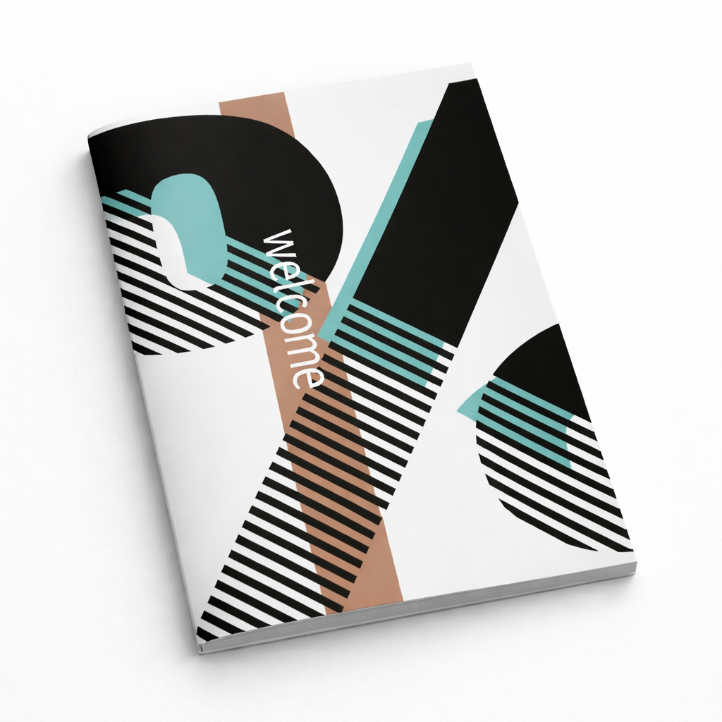
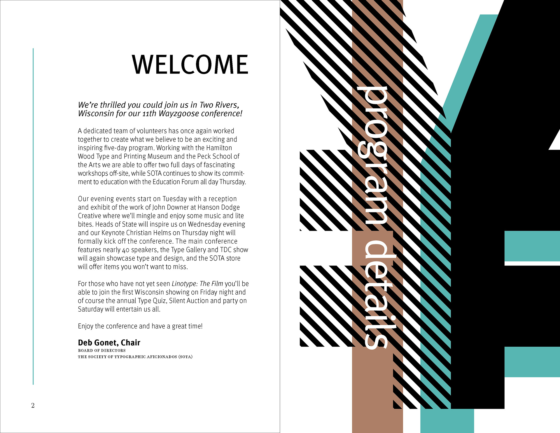
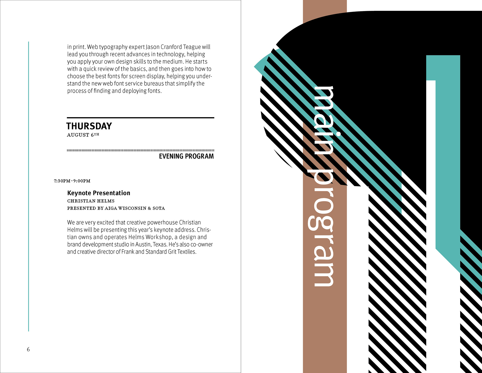
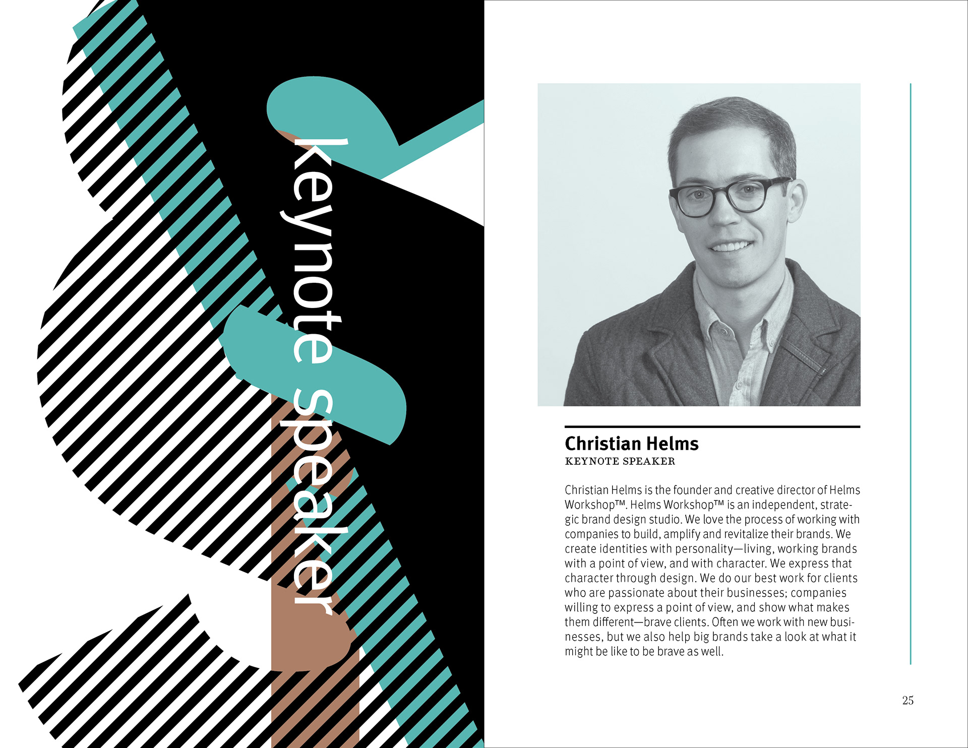
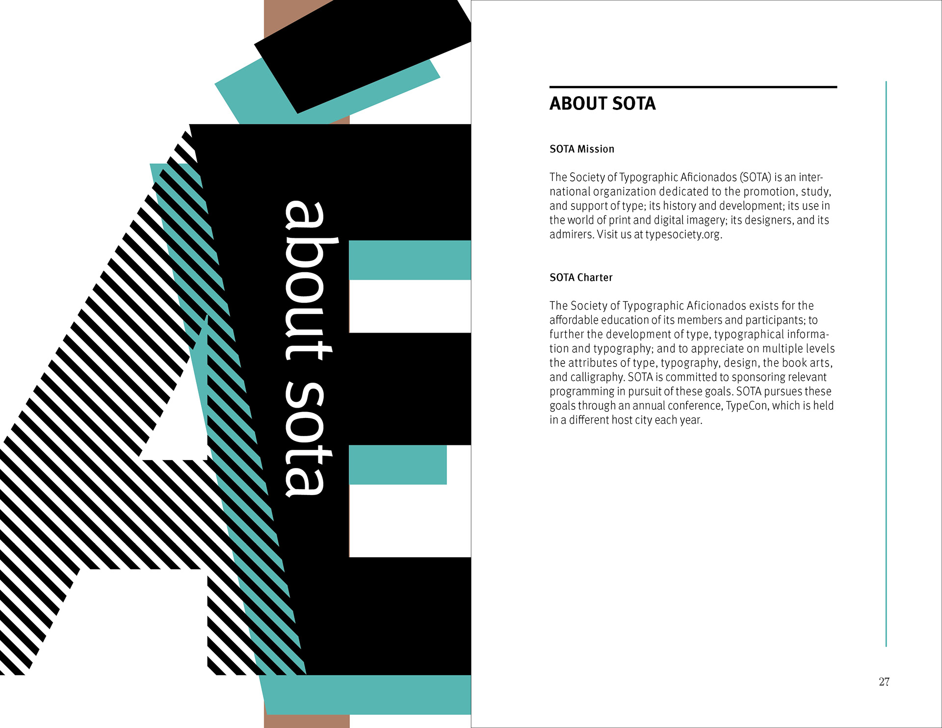
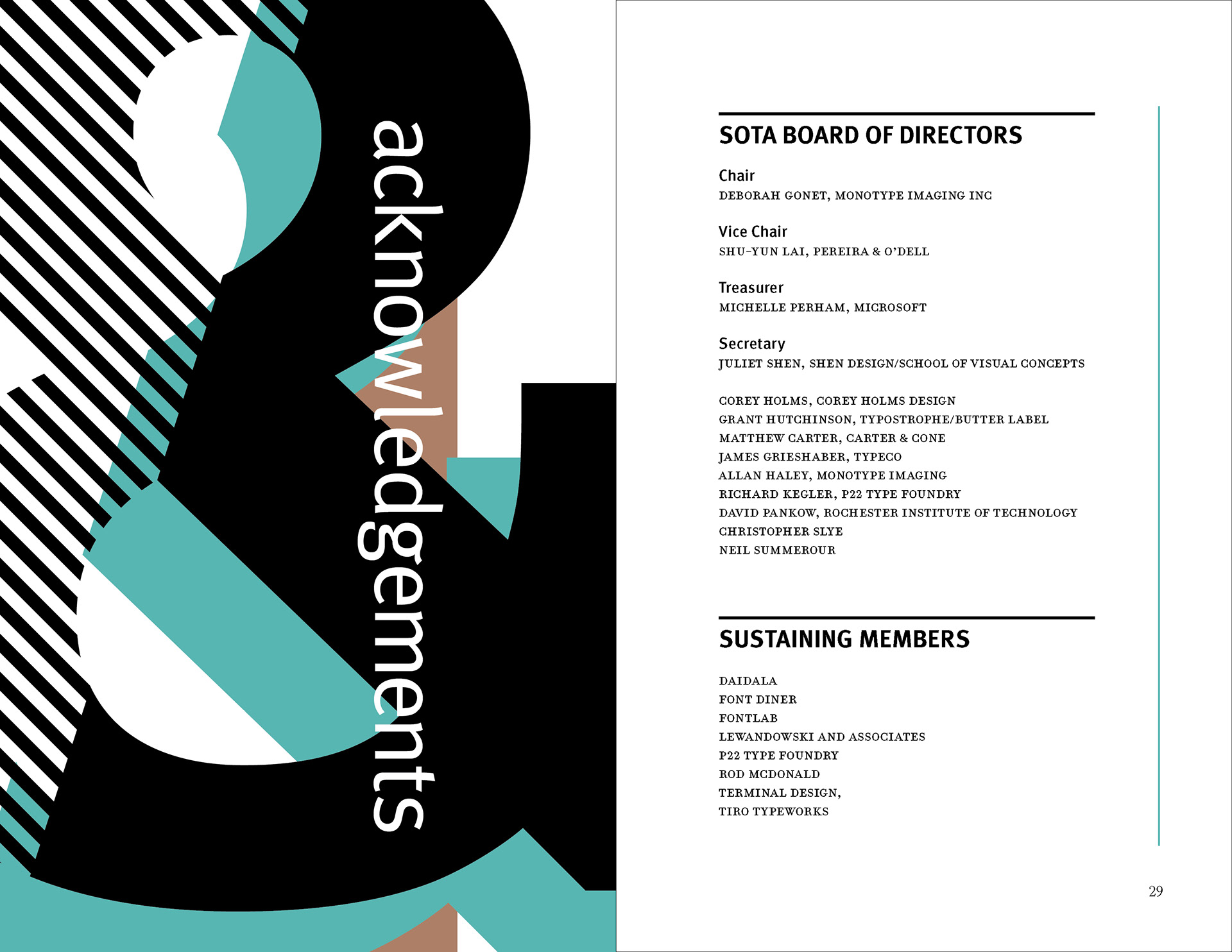
Cover: Cropped geometric forms, diagonal striping, and vertical type establish the brochure’s visual vocabulary before the reader enters the program.
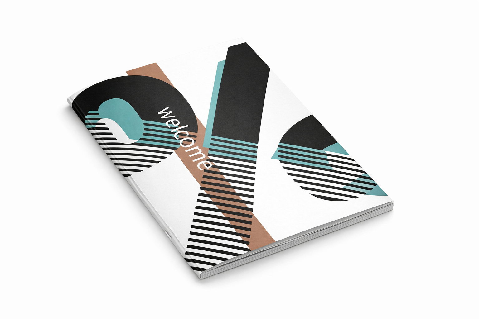
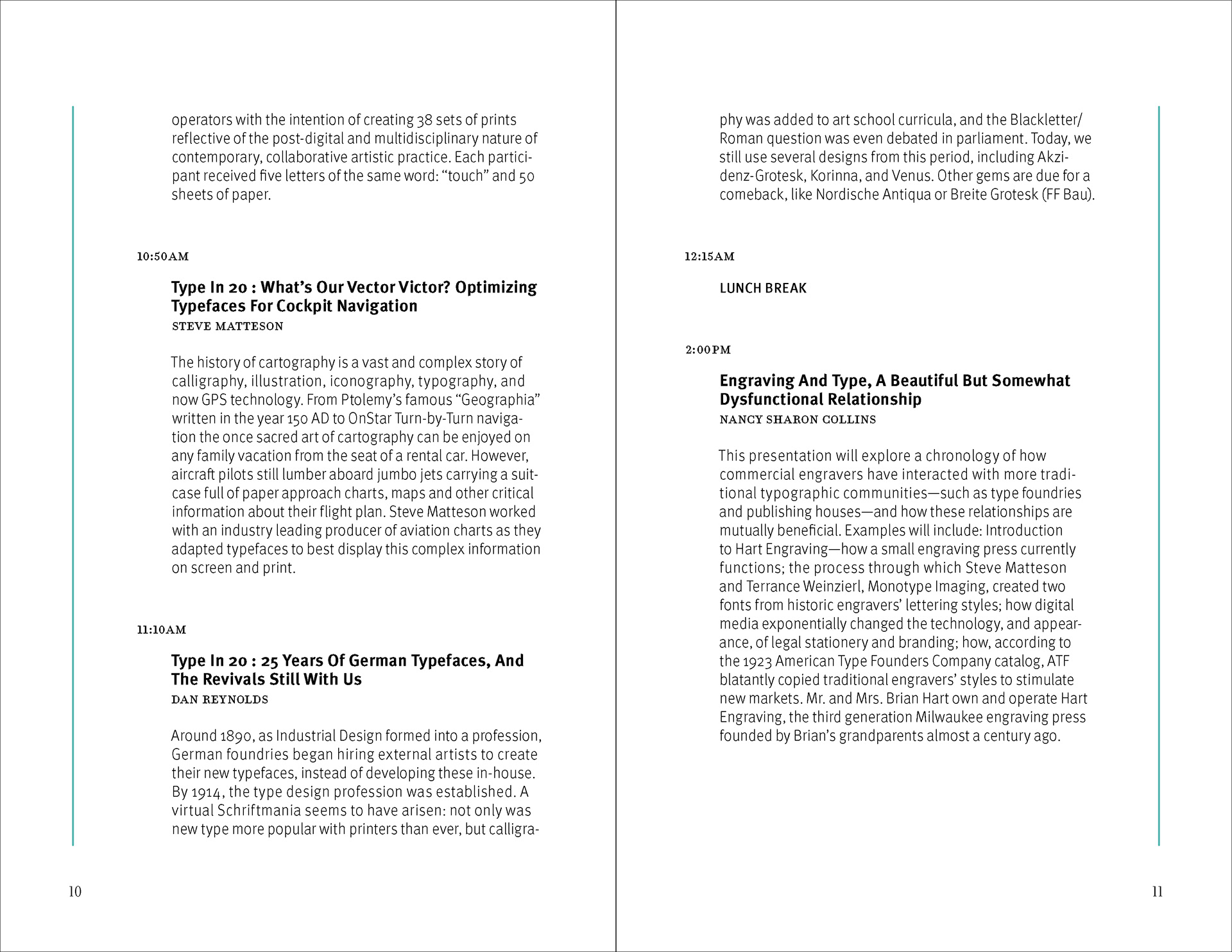
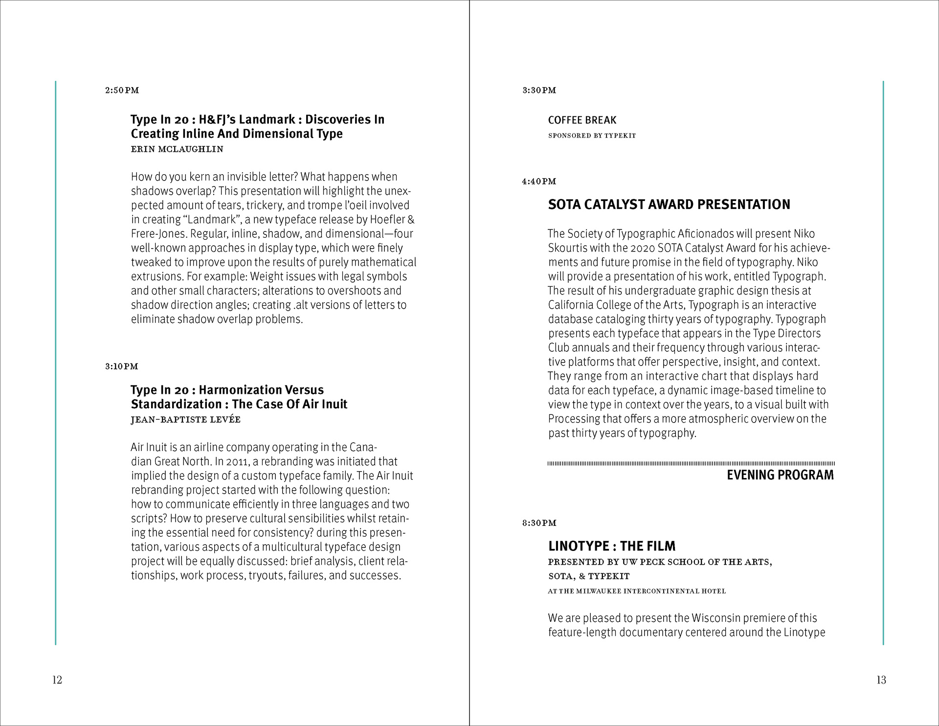
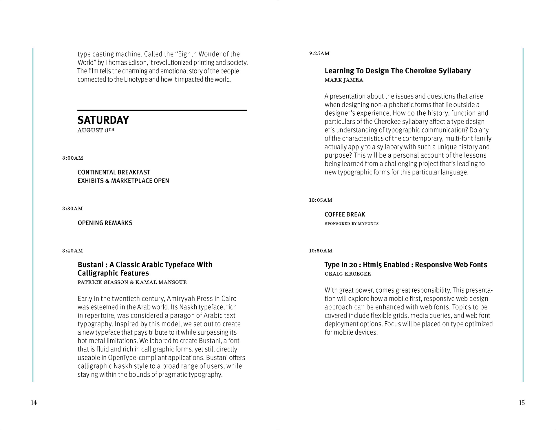
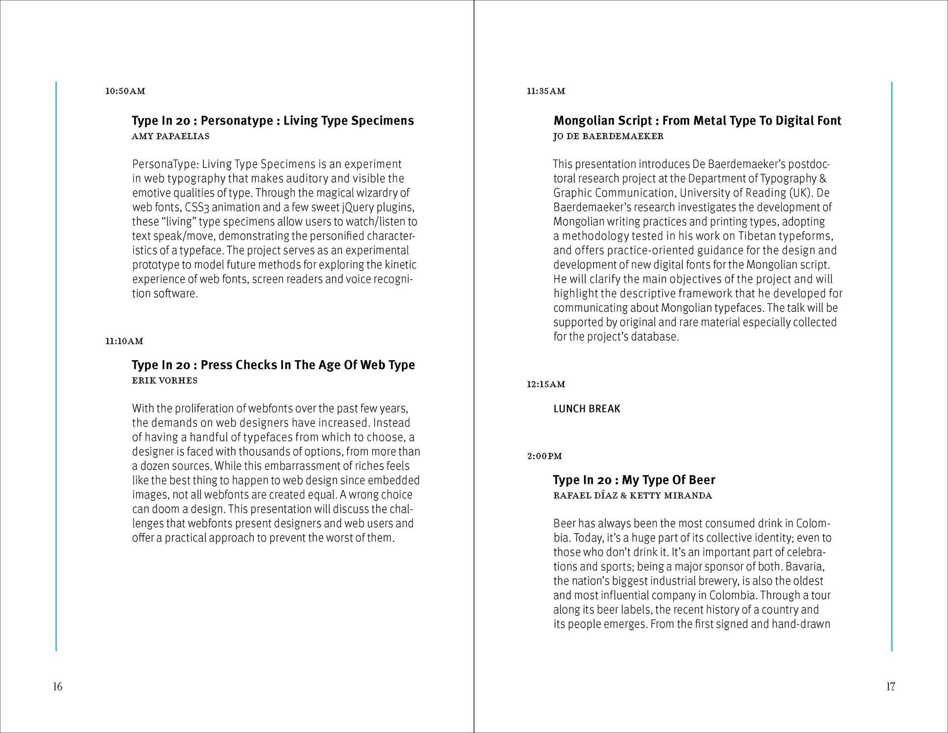
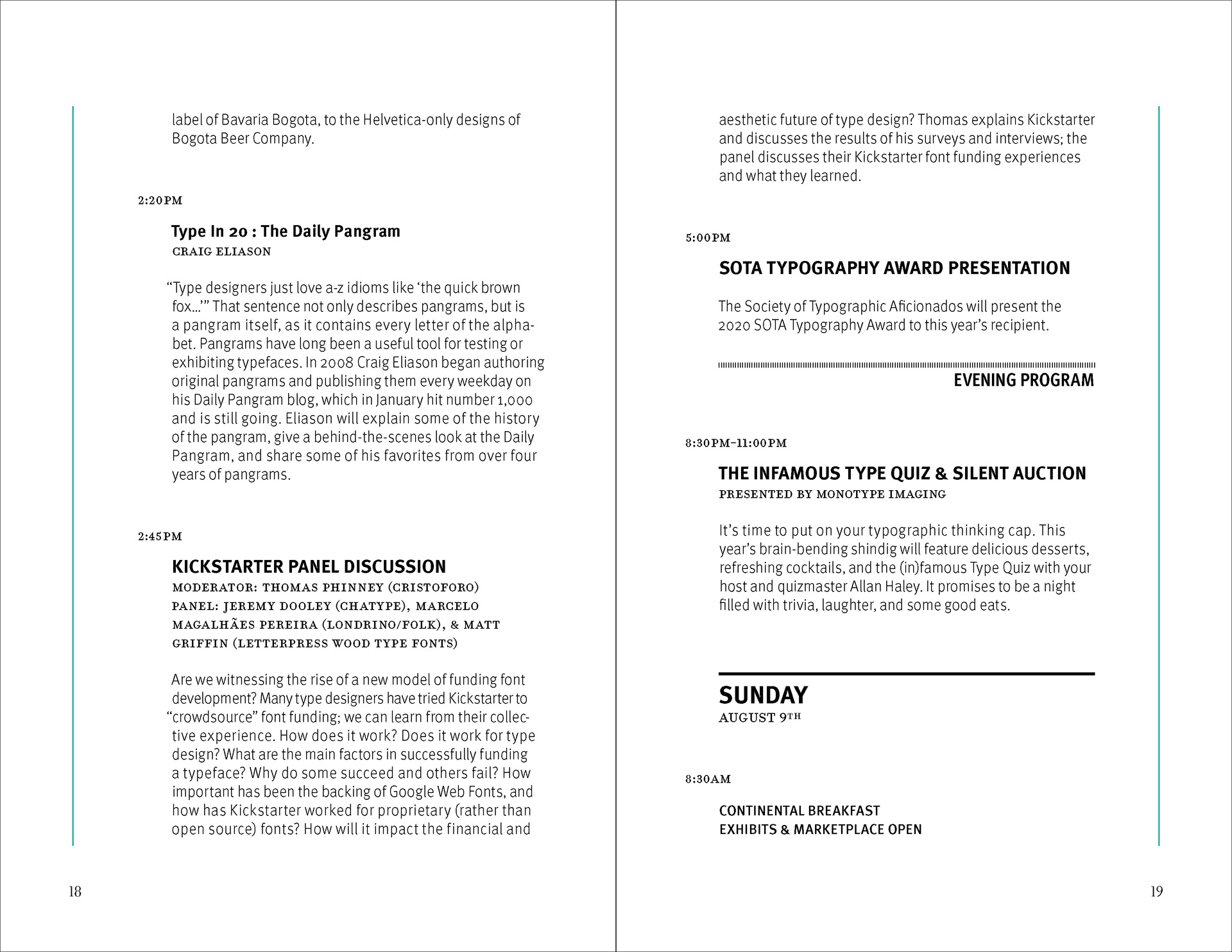
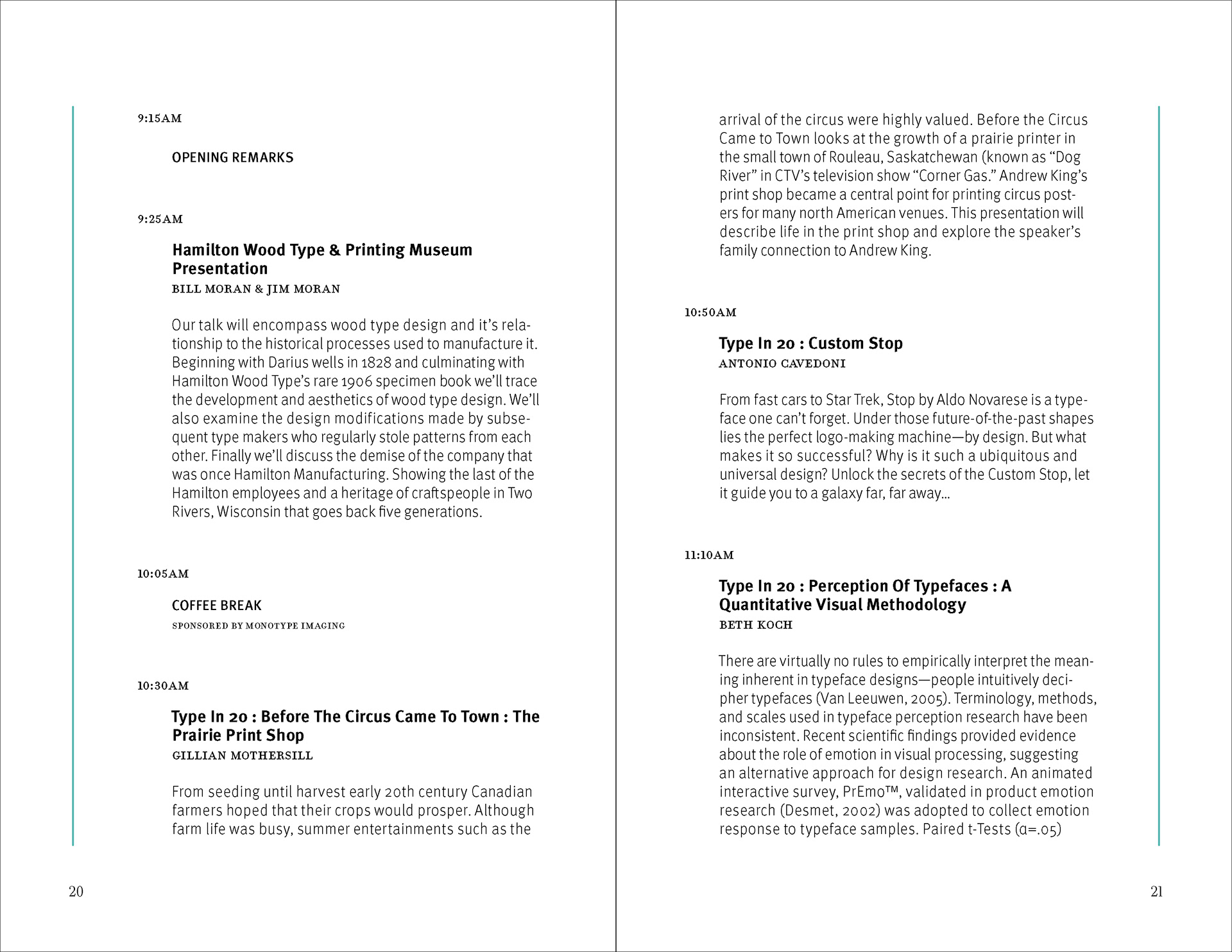
A conference program must accommodate two kinds of reading: sustained attention to speakers and ideas, and quick reference to schedules and locations. After attending Wayzgoose and finding its printed program hard to use, I redesigned the brochure as a self-initiated project, developing a page system that supports both while giving the typographic event a distinctive visual identity.
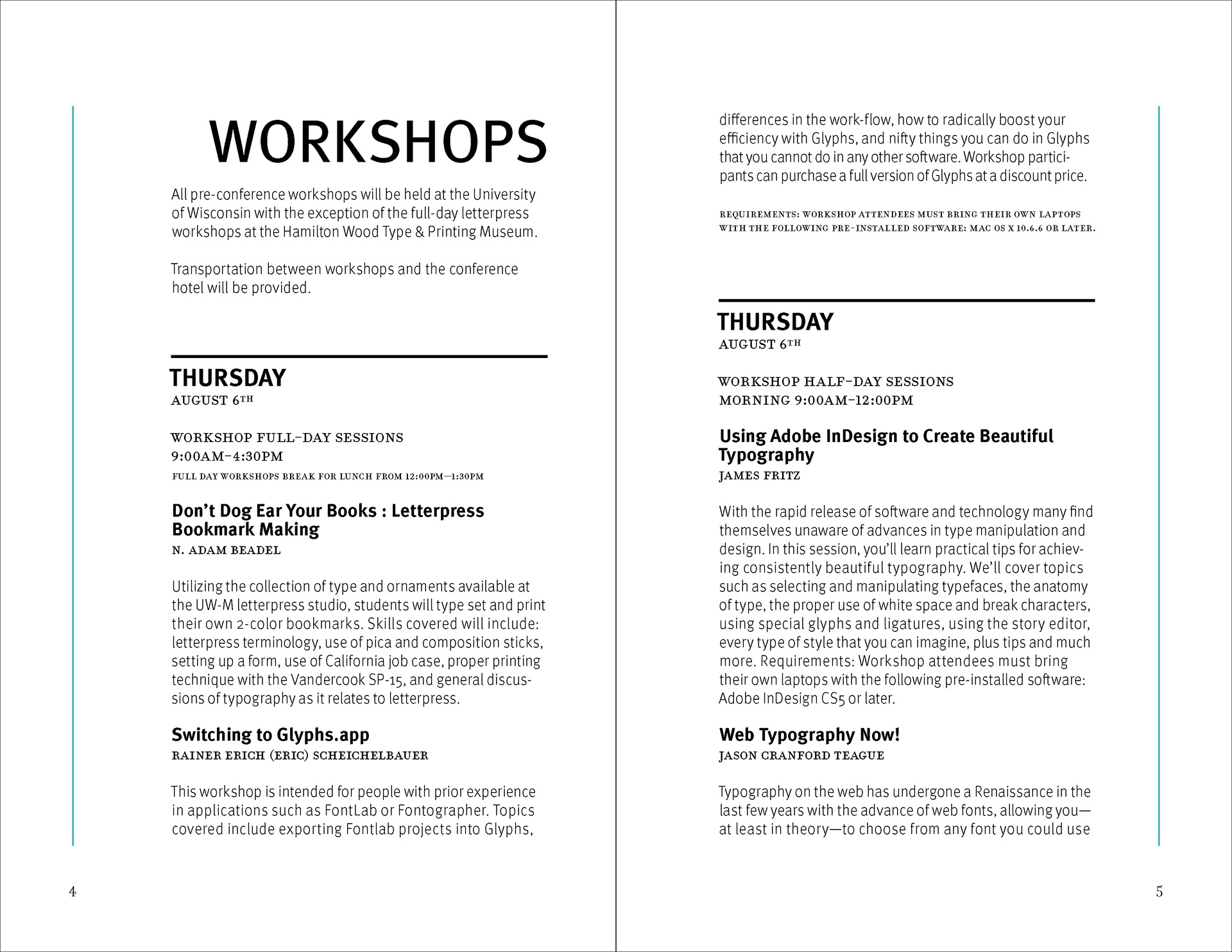
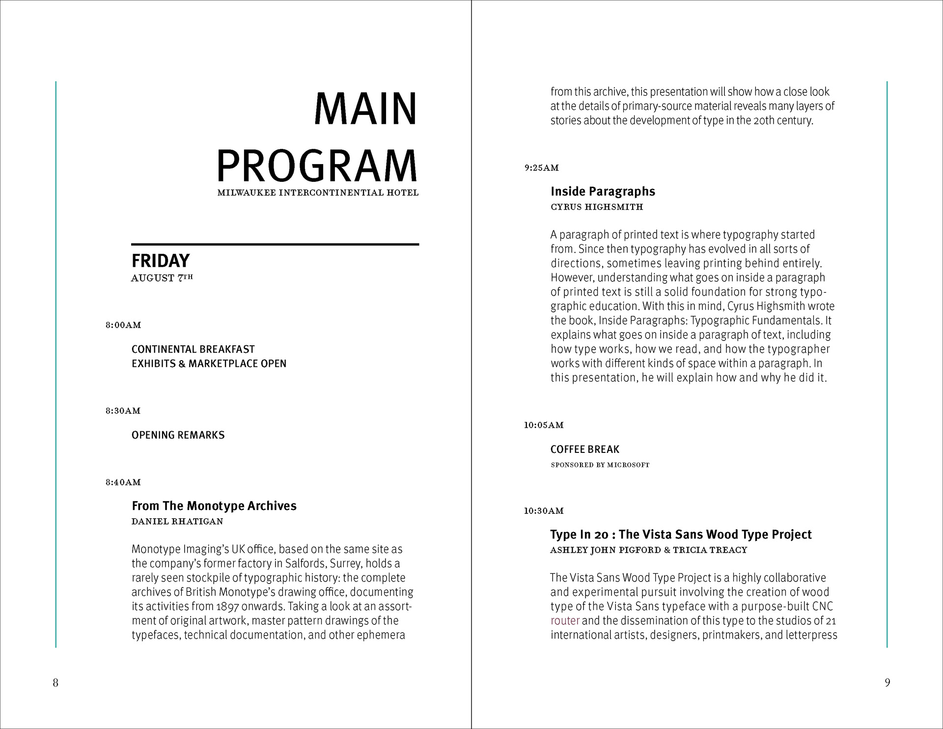
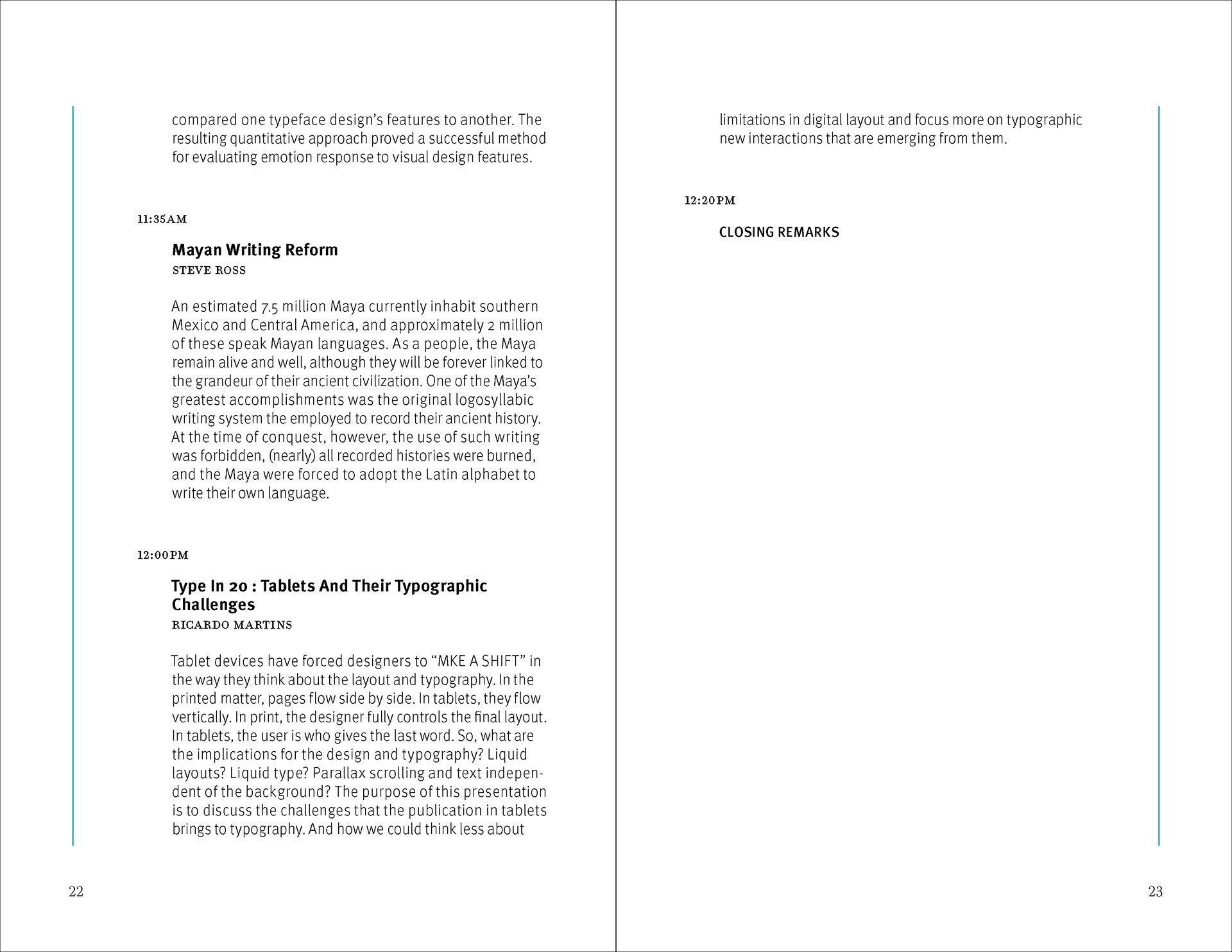
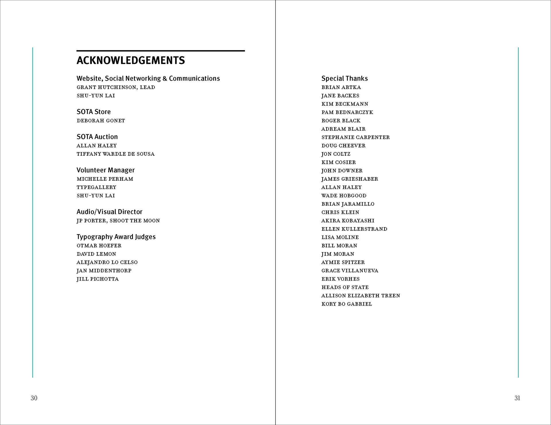
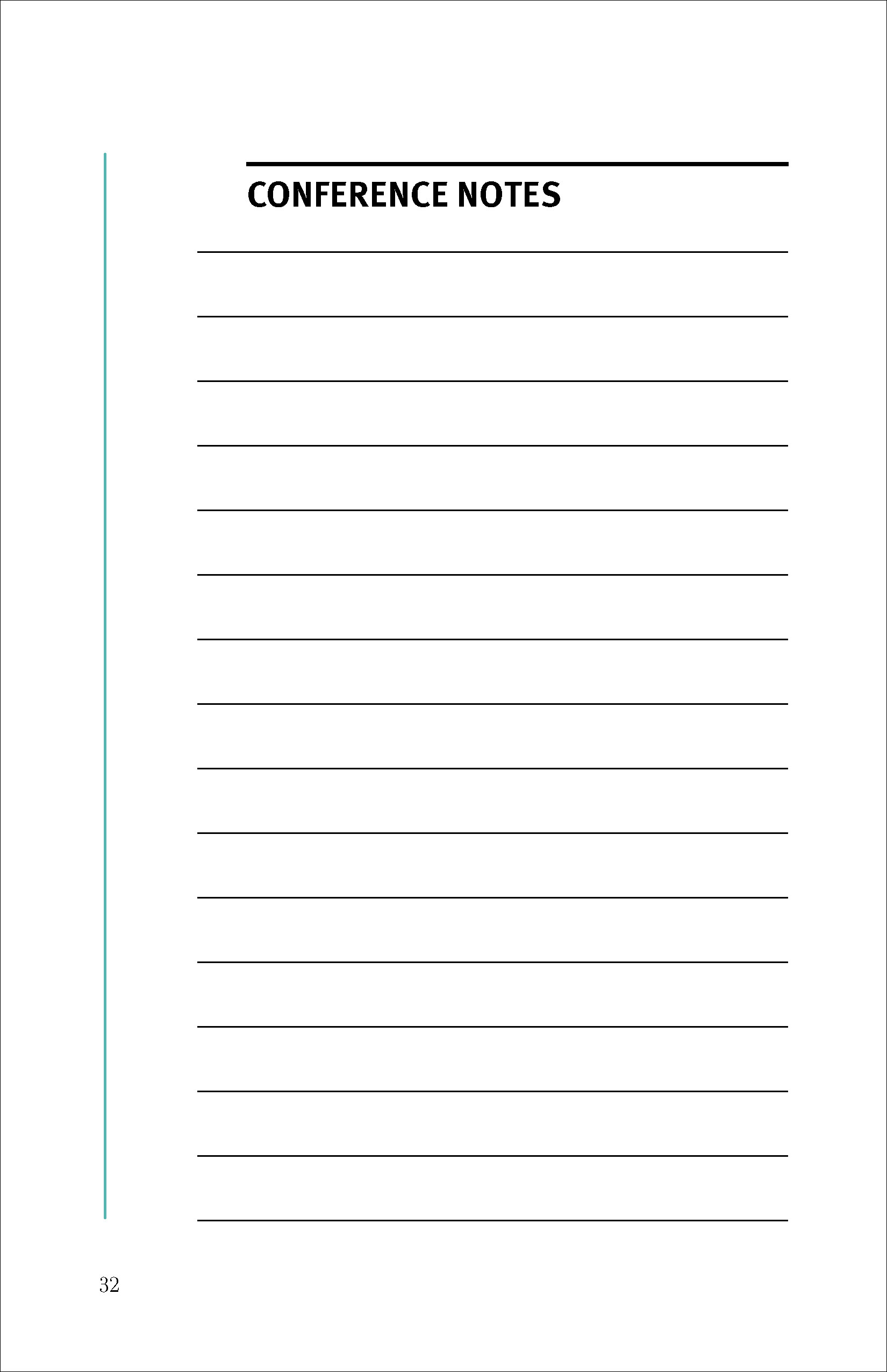
Oversized, cropped letterforms and diagonal patterns establish the publication’s sectional rhythm. A limited palette of black, white, aqua, and muted brown connects those expressive pages to the more restrained program spreads. Within the information pages, thin aqua rules, consistent columns, and restrained headings organize schedules, speaker descriptions, acknowledgments, and reference material.
The central design decision was how much variation the system could accommodate without weakening orientation. Changes in scale and density give each section a role, while repeated alignments and typographic relationships keep the publication coherent.