Kent State University • Typography I
Sequential Typographic Design: Booklet
Student designer: Braedy Luxenburg
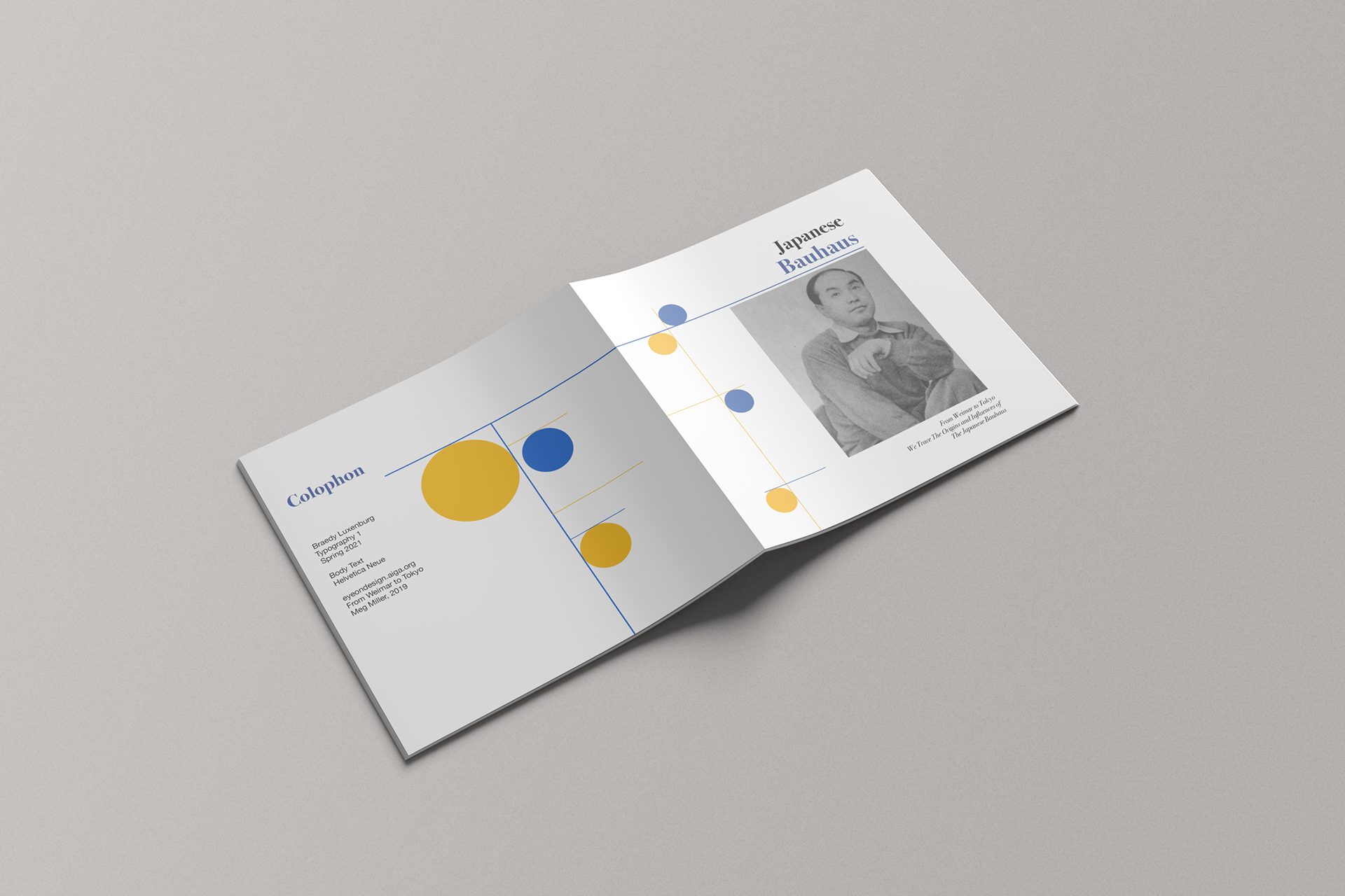
Title and colophon spread: Blue and yellow circles linked by fine rules connect the publication details to the title and opening portrait.
Assignment and teaching focus
This eight-page booklet assignment introduces editorial sequence through a design-related topic selected from the AIGA website. Students research and curate supporting text and imagery, then organize that material into a focused narrative.
The instructional emphasis is on relationships within and between spreads: typographic hierarchy, reading order, image placement, and changes in density. Students must establish continuity across the publication while adapting the layout to different kinds of content, including historical background, quotations, and supporting references.
Selected student response
In Japanese Bauhaus, Braedy interprets the movement’s connection to Japan through a restrained system of blue and yellow circles, fine rules, serif headings, and sans-serif body text. The geometric elements change scale and position across the booklet, providing continuity without imposing an identical composition on every spread.
A contents page establishes the sequence, while a prominent quotation and connected maps introduce a geographic relationship within the narrative. The concluding spreads accommodate denser text and a cut-out portrait. The selection shows how a limited visual vocabulary can support varied editorial material, with recurring forms providing continuity as the reading demands change.
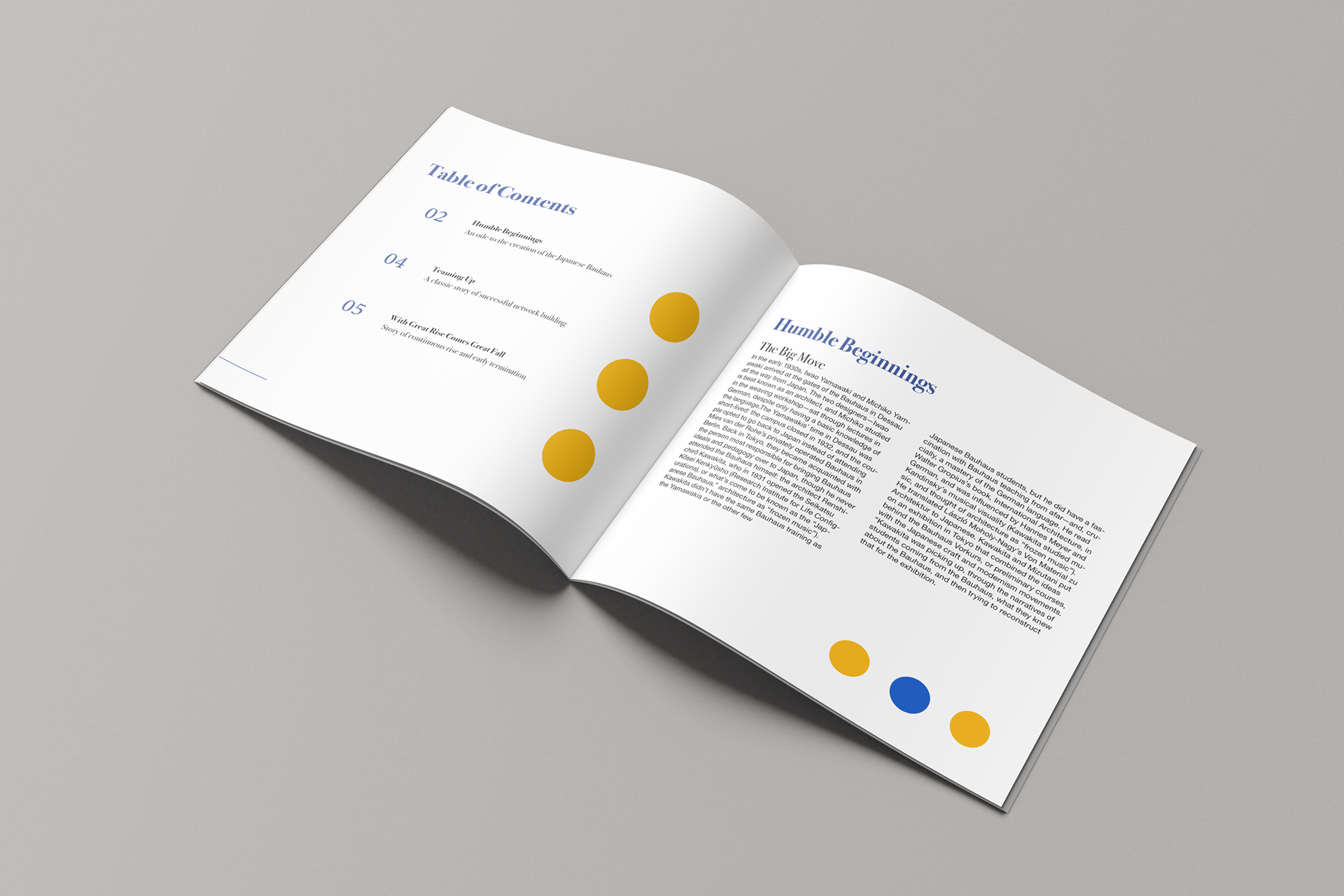
Contents and introduction: Italic headings, page numerals, and generous spacing establish navigation before the narrative begins in two-column text.
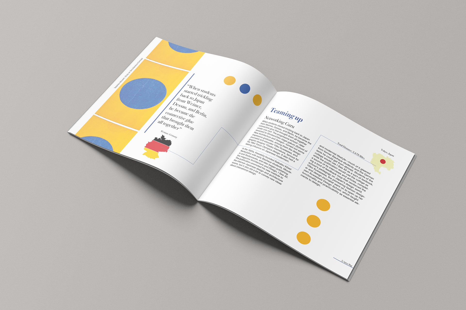
“Teaming Up”: A large quotation and geometric color panel establish emphasis, while a fine rule connects maps of Germany and Japan across the spread.
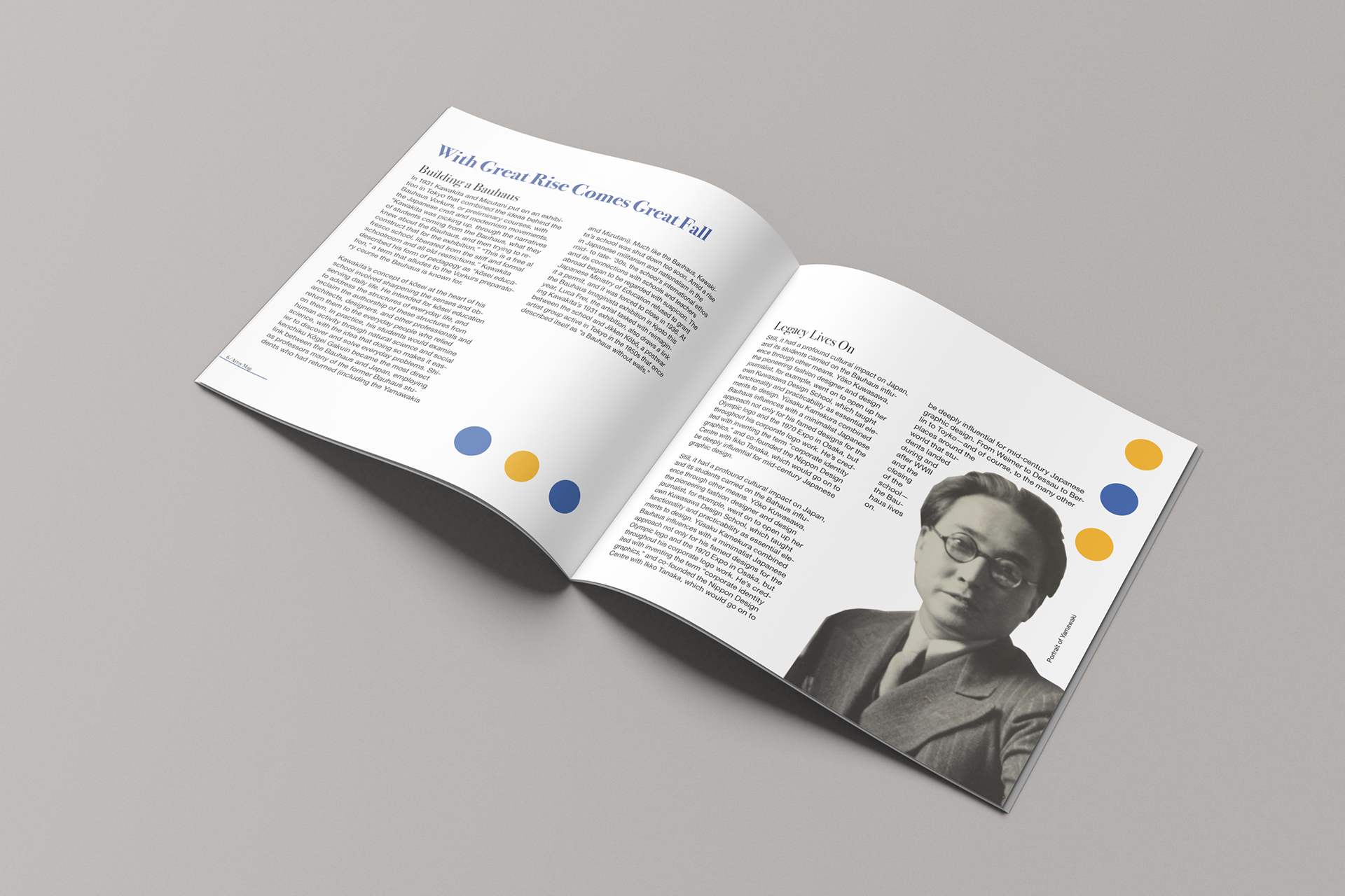
Concluding spread: Two-column text, a cut-out portrait, and recurring circles bring the historical narrative to its close.
Publication details: Japanese Bauhaus, Typography I, Spring 2021. Body text set in Helvetica Neue. Source: “From Weimar to Tokyo” by Meg Miller, 2019, AIGA Eye on Design.
Where he is now: Braedy is now a fashion designer and the founder and creative director of Luxenburg, a New York–based label that has shown at New York Fashion Week. Follow Luxenburg on Instagram.

