Kent State University • Typography I
Sequential Typographic Design
Student designer: Fiona Burnham
Assignment and teaching focus
The eight-page booklet introduces a new design responsibility: organizing a reading experience across time. Students select a design-related topic from the AIGA website, research and curate supporting text and imagery, and establish a sequence with a beginning, development, and close.
The assignment emphasizes hierarchy within each spread and continuity between spreads. Students must consider how recurring typography, image treatment, and navigation support a narrative without making every page identical.
Selected student response
In From DIY to Design Led, Fiona examines Ed Marszewski and independent publishing through condensed display type, halftone imagery, and a magenta accent. The rough textures connect the publication’s subject to its visual treatment. A contents spread, quotation, article columns, and timeline establish different reading conditions within that vocabulary. The colophon returns to the cover’s repeated imagery. The selection shows a concept sustained across a sequence while its hierarchy changes with the content.
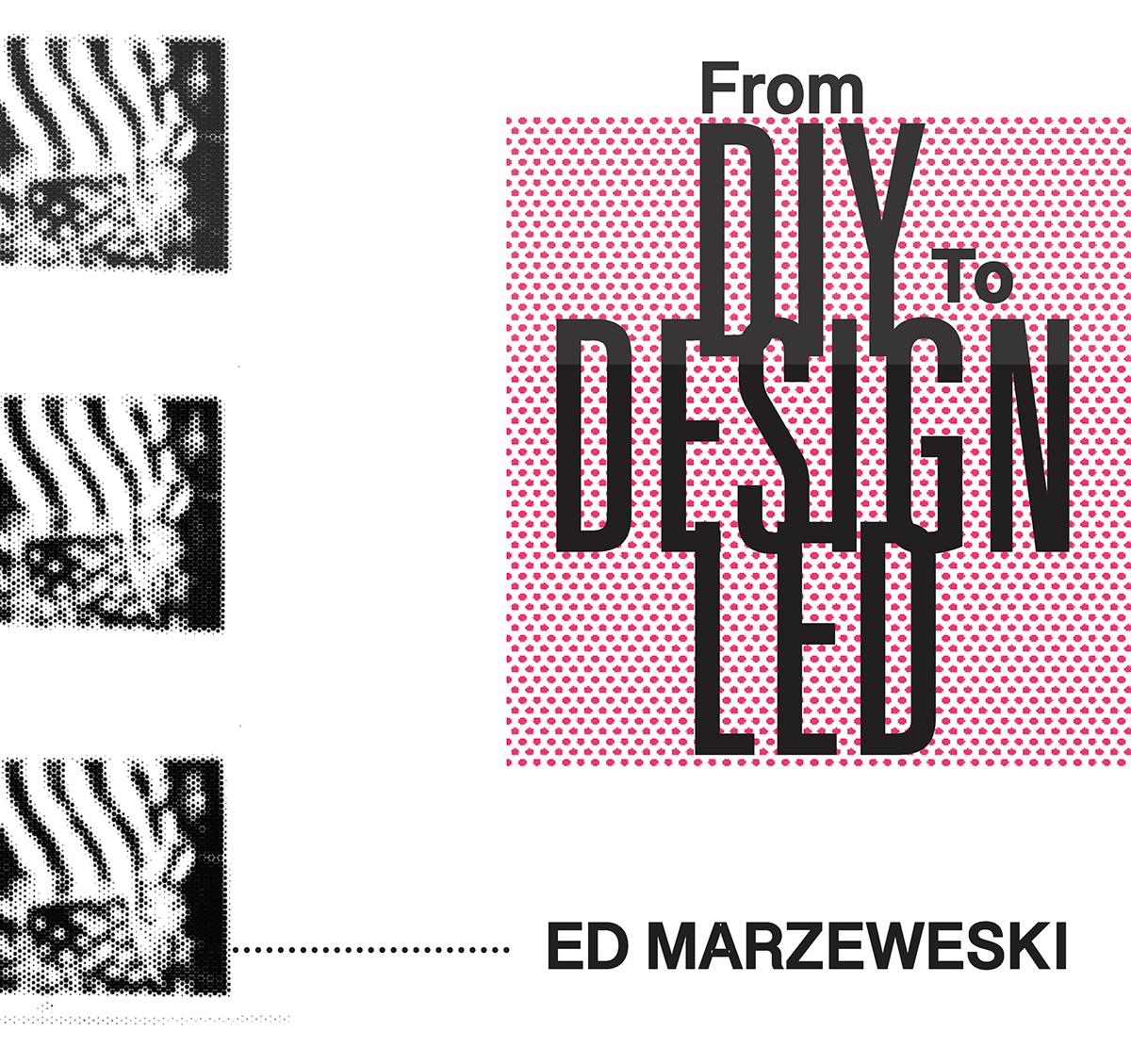
Cover: Stacked display type and halftone imagery establish the booklet’s visual language.
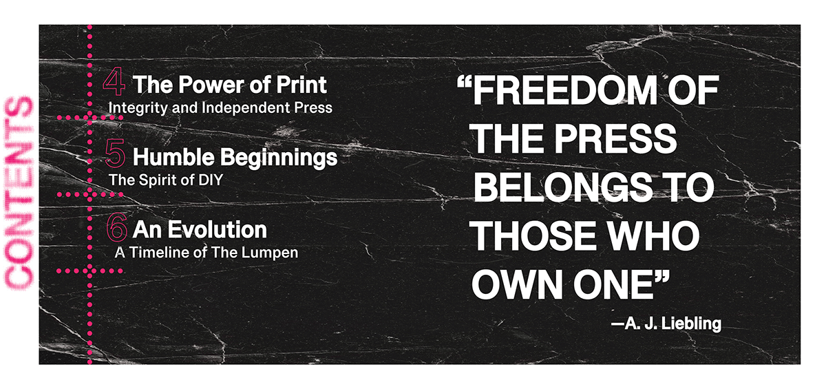
Spread 1: A contents structure and pull quotation introduce navigation and emphasis.
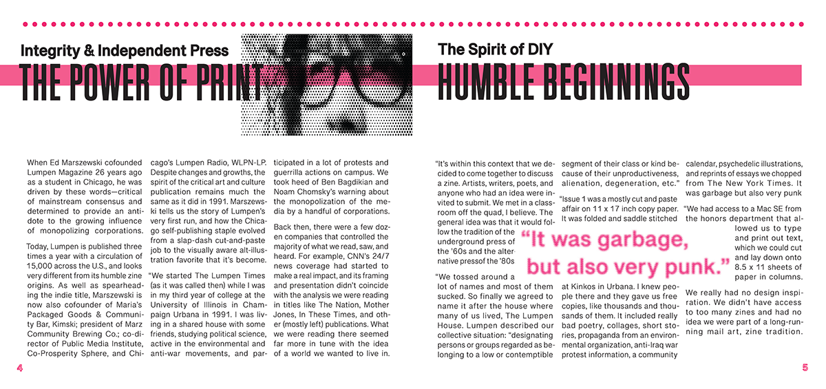
Spread 2: Columns, a headline band, and a portrait balance reading density with a strong focal point.
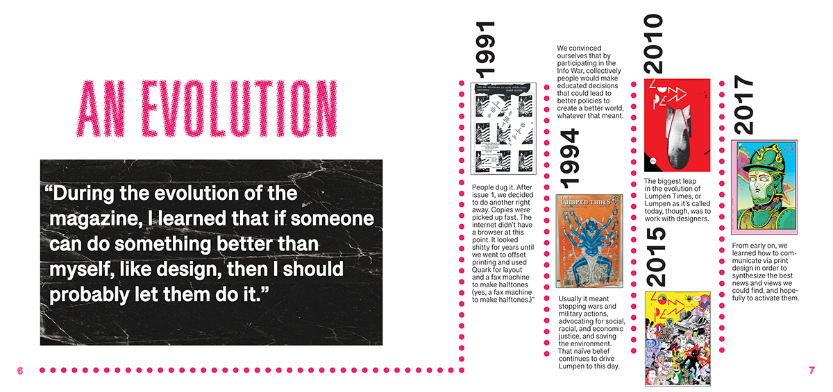
Spread 3: Oversized type, a quotation, and a timeline establish a chronological sequence.
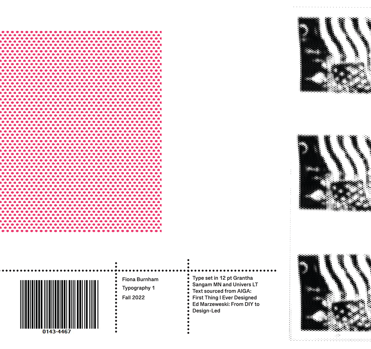
Back cover: A restrained colophon uses spacing and repeated details to conclude the publication.

