Kent State University • Typography I
Typographic Systems and Information Hierarchy
Student designer: Fiona Burnham
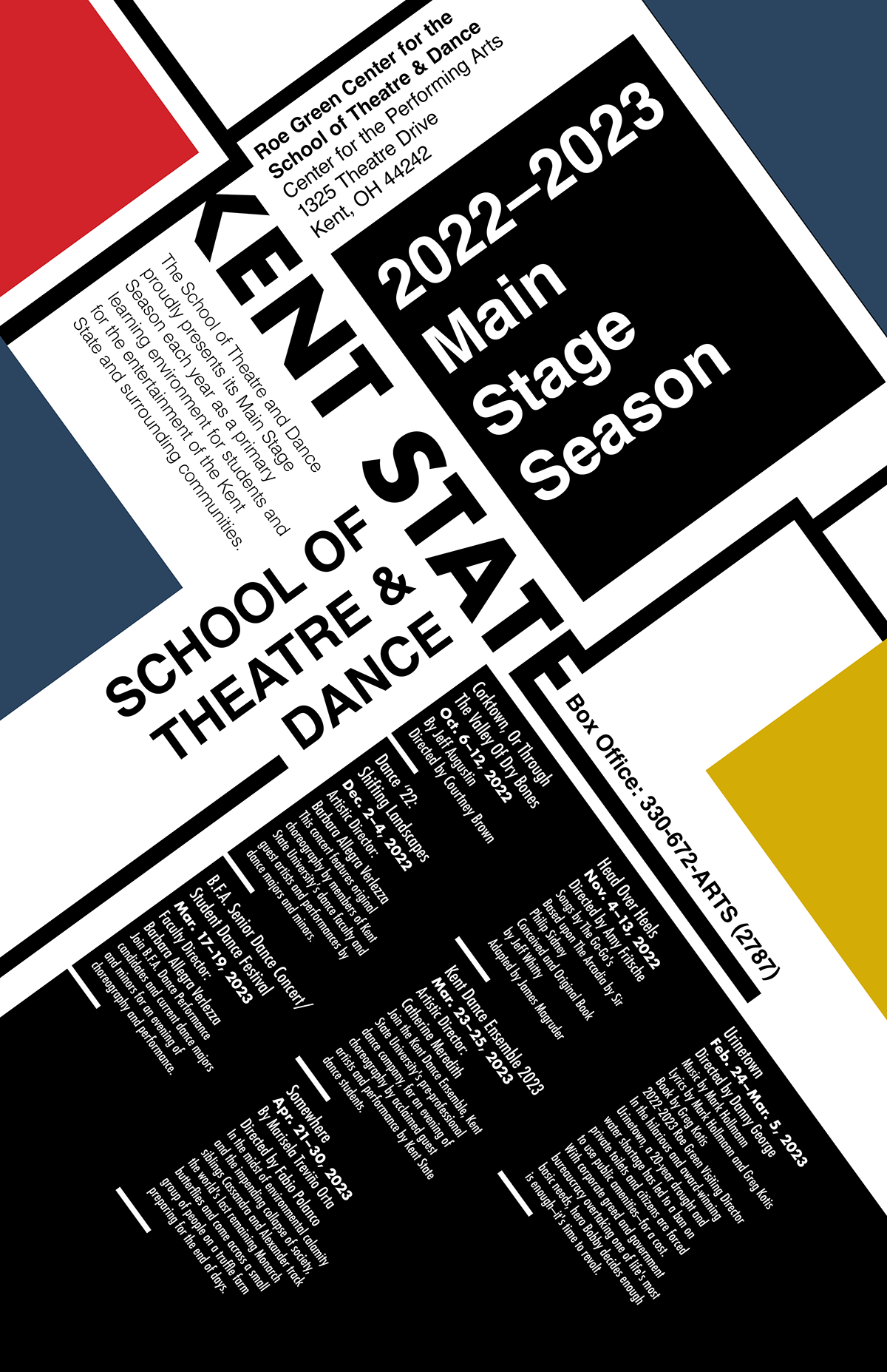
Season poster: Contrasting type sizes, modular divisions, and directional changes organize multiple events within one typographic composition.
Assignment and teaching focus
This assignment asks students to organize a theatre season using typography as the principal means of communication. Students begin with a content audit, identifying primary, secondary, and tertiary information and determining which details belong together.
The constraint places emphasis on both macrotypography—overall structure, scale, and pacing—and microtypography, including alignment, leading, tracking, and spacing. Rules, shapes, bullets, and reversed type may support the typography, but imagery cannot substitute for a clear informational structure.
Selected student response
Fiona organizes the 2022–2023 main-stage season through diagonal divisions, black-and-white information blocks, and red, blue, and yellow fields. Changes in scale distinguish the school name and season identifier from the production listings. The composition draws on modernist typographic conventions while keeping related information together. Its angled structure makes the relationship between visual energy and reading orientation an explicit part of the design problem.

