Kent State University • Typography I
Sequential Typographic Design: Booklet
Student designer: Jasmine Hudson
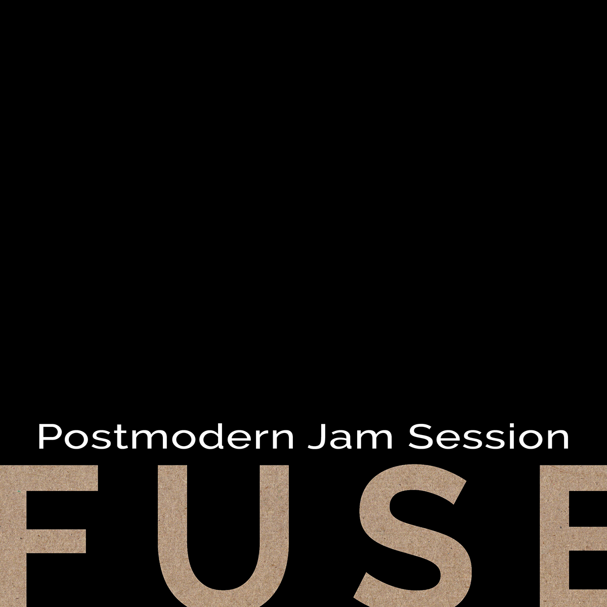
Cover: Large type, negative space, and a textured FUSE element introduce the subject.
Assignment and teaching focus
This eight-page booklet assignment introduces editorial sequence through a design-related topic selected from the AIGA website. Students research and curate text and images, then organize them into a coherent reading experience.
The instructional focus moves from the individual composition to relationships among pages: recurring hierarchy, transitions, image placement, and changes in density. The assignment also asks students to make editorial choices about what information to include and where it belongs.
Selected student response
Jasmine’s FUSE booklet uses restrained black covers to frame an interior of blue serif headings, orange rules, and modular layouts. A timeline establishes chronology; reproductions of FUSE material and portraiture connect the subject to the accompanying text. Large page numerals reinforce the sequence. Presented alongside Fiona Burnham’s booklet, this response shows how shared learning goals can support distinct visual languages: one foregrounds DIY texture, while the other uses a more restrained editorial framework.
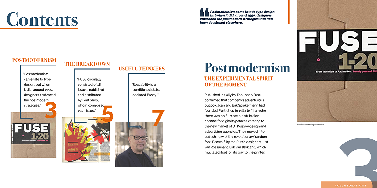
Spread 1: Modular text and anchored imagery establish contents and navigation.
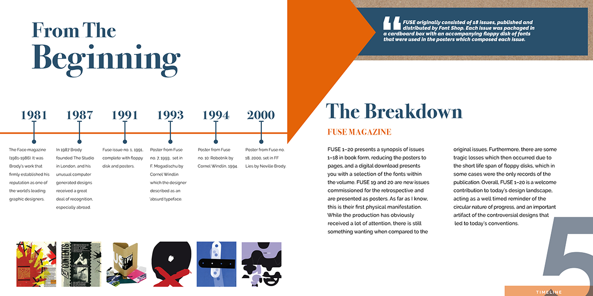
Spread 2: A timeline and geometric forms organize chronology across the gutter.
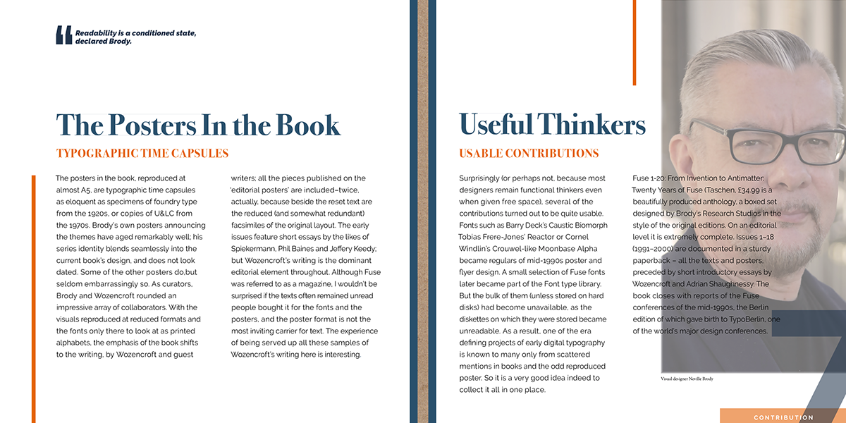
Spread 3: A portrait, headline, and quotation establish entry points within denser text.
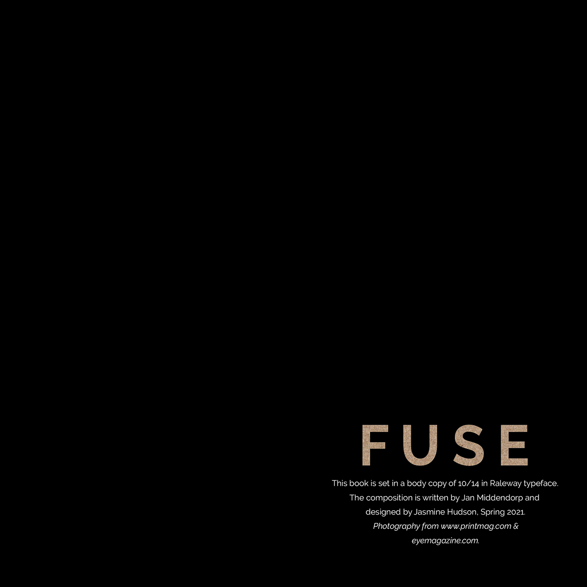
Back cover: A minimal wordmark and small credits bring the sequence to a quiet close.

