Kent State University • Graphic Design I
Short-Term Event Identity: Poster and Postcard
Student designer: Mai West
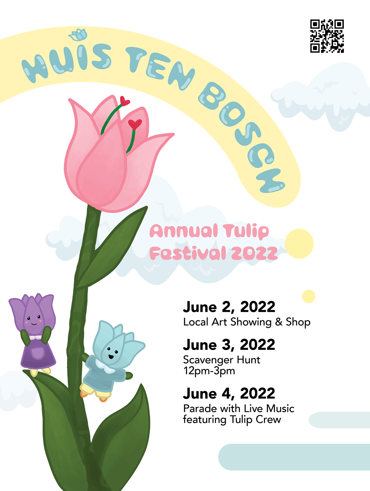
Poster: An oversized tulip, character illustration, and curved festival title establish the event identity.
Assignment and teaching focus
This event-identity assignment asks students to connect research into an organization and a selected city with a coordinated visual program. Students investigate purpose, audience, and location before developing and refining concepts for a poster and postcard.
The teaching focus is on the relationship between context and form. Typography, color, and imagery must establish a recognizable identity while adapting to the scale and information requirements of each format.
Selected student response
Mai’s proposal for the Huis Ten Bosch tulip festival combines an oversized pink tulip, character illustration, cloud shapes, and rounded display lettering. A dark poster field gives the flower emphasis, while the postcard shifts to a light blue invitation and a reverse organized around dates and location. The work shows how a recognizable image vocabulary can support different tones and tasks. The schedule appears on the postcard reverse, where it can be read separately from the poster’s primary promotional message.
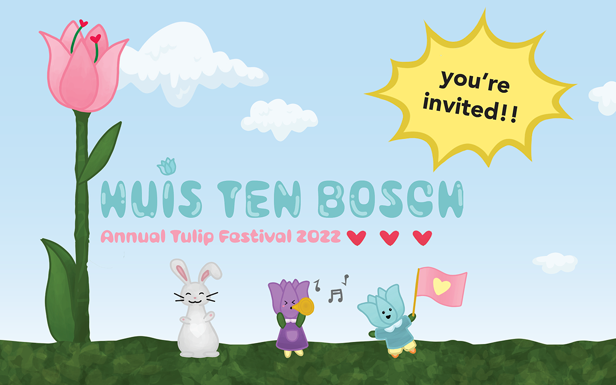
Postcard front: Character imagery and display type establish the invitation’s tone.
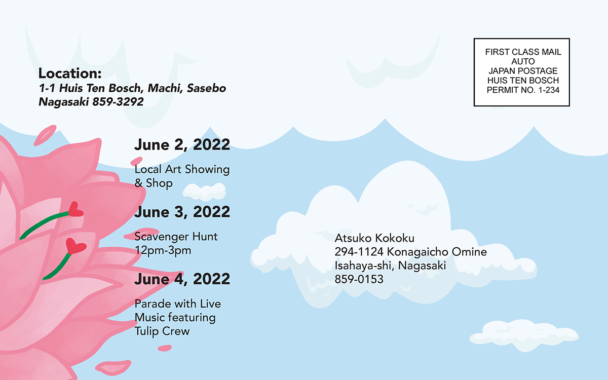
Postcard reverse: Event details and mailing requirements are grouped alongside the illustration.

