Using Visual Language to Reduce Patient Barriers and Medication Errors
MFA Thesis · Visual Communication Design · Kent State University · 2022
My graduate research explored how typography, information hierarchy, and label orientation could help patients locate and understand prescription information. The project approached the prescription label as a design problem: how can a small, curved surface communicate information that people need to use medication safely?
The problem
Prescription labels bring together patient information, medication instructions, pharmacy details, and other content within a limited space. My investigation examined how small type, competing priorities, and text wrapping around a bottle could complicate reading. Conversations with people with low vision helped focus the project on legibility and the physical experience of finding information.
The design approach
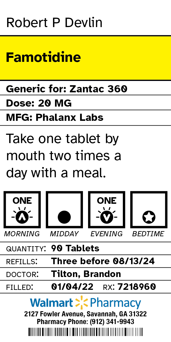
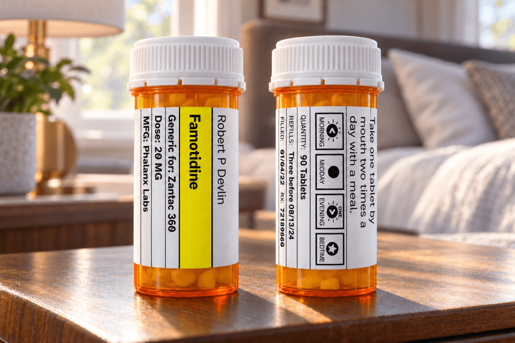
I developed a label prototype that gave greater prominence to the information patients need to identify and take their medication. The design combined larger typography, a revised information hierarchy, visual cues for medication administration, and Atkinson Hyperlegible—a typeface with distinctive letterforms that help differentiate similar characters.
The prototype also changed the text’s orientation. With the bottle held sideways, readers could view complete lines and rotate the bottle to move through the information. This approach explored how an existing prescription bottle could support a different reading experience without requiring a new container.
The investigation
The study combined physical label prototypes, a computerized questionnaire, a four-minute captioned and narrated educational video, and follow-up conversations. Participants answered questions using conventional and redesigned labels before and after viewing the video. The questions examined their ability to locate and interpret information such as dosage, refill availability, and the prescribing physician.
Participant feedback identified larger type and ease of reading as appealing features. The conversations also revealed opportunities for refinement, including changes to the medication-administration graphics and, in a separate interview, a pharmacist’s concern about space for warnings.
Contribution and limitations
The project connects graphic design practice with questions of accessibility, health literacy, and patient communication. Its contribution includes a label prototype and a research process for examining how people interact with prescription information.
The findings should be treated as exploratory. The study does not establish that the redesigned label reduces medication errors or improves adherence in everyday use. Further validation of the scoring and analysis, broader testing, and evaluation in a pharmacy setting would be necessary before drawing stronger conclusions about effectiveness.
The thesis is also available from the OhioLINK ETD Center.

